Cheep
Chrome extension
Keep track of prices across the internet, check price history, and receive notifications when prices drop
Introduction
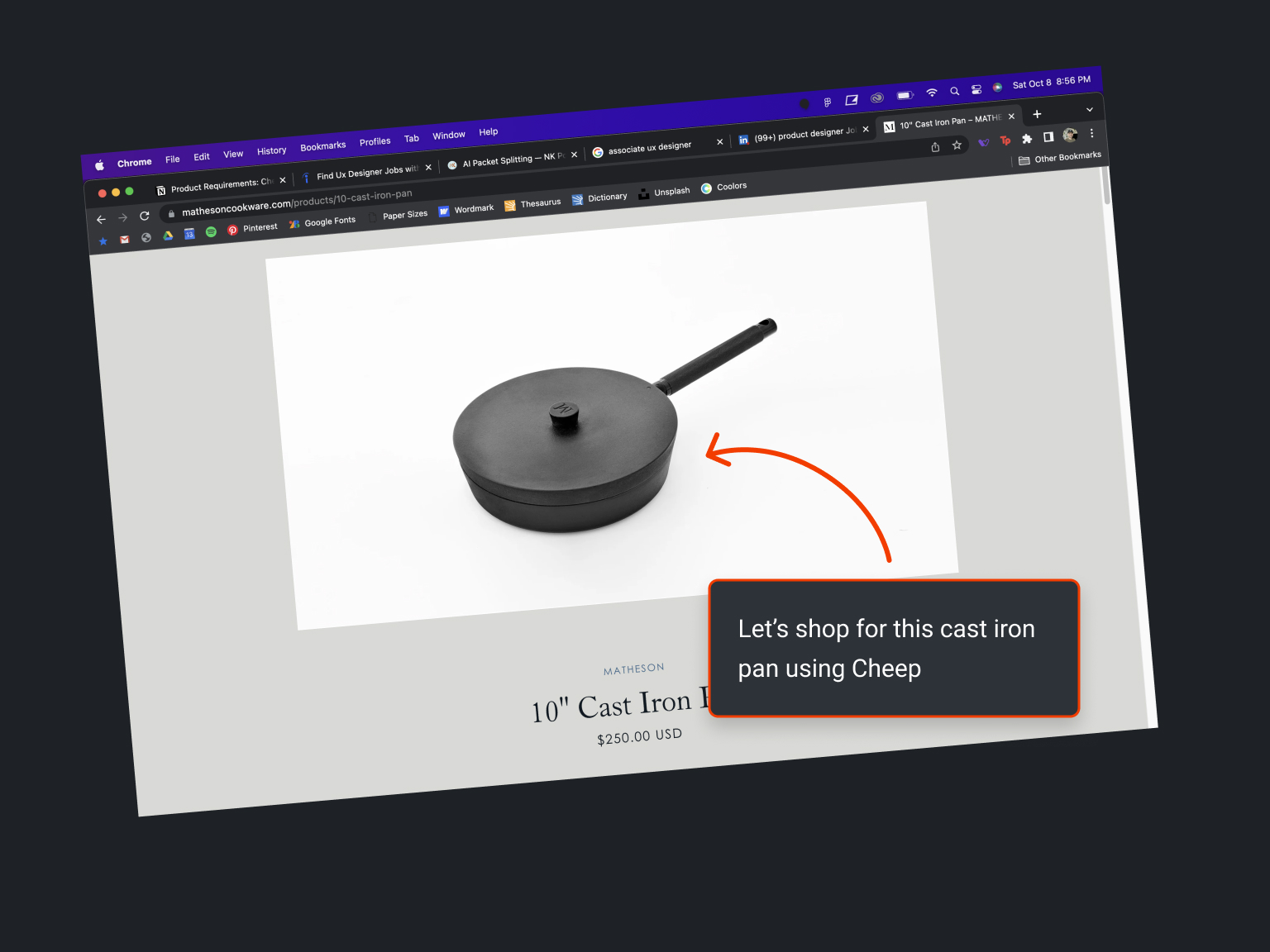
Imagine if you could add any product on the internet to a personalized list that tracks prices for you. And what if you received notifications the moment those products hit your desired price? That’s the magic of Cheep, a Chrome browser extension designed to make savvy shopping effortless.
Cheep marked my first experience working in a team. Guided by my mentor, I had the chance to test my design skills while learning some new ones.
This project underscored the value of constructive feedback and collaboration in achieving successful outcomes.
What are we building and why?
The first thing we did together was write a product requirements document, step by step.
We used the PRD to outline these aspects of the project:
- Background
- Success criteria
- User stories
- High-level UX
- Requirements
Using AJ's expertise, we pinpointed the pain points faced by online shoppers, formulated a problem statement, outlined our assumptions, and roughed out high-level UX flows to address these issues.
I spent the next week researching online shoppers and their motivations for making (or not making) purchases.
I explored the problem of cart abandonment, how to leverage psychology to increase conversions, and the most effective methods of notifying our users.
- How many people shop online?
- To them, what constitutes a good deal?
- How much do they need to save before making a purchase?
- What additional factors influence their buying decisions?
Our solution had to be more than just an online bookmark for products. We needed to understand the nuances of user behavior and buying motivations.
Understanding Cart Abandonment
According to Shopify, these are the top 4 reasons for cart abandonment:
- Unexpected costs (shipping, taxes, fees, etc.)
- Account creation is required
- Complicated checkout process
- Security concerns
Information which is backed up by research performed at Baymard Institute:
This insight was helpful in determining which information was vital to users and what could drive conversions.
Leveraging Psychology to Increase Conversions
According to voucherify.io, people aren’t willing to think very hard about how much money they’re saving. Instead, they just opt for whatever sounds like the best deal.
Imagine you’re getting ready to make an online purchase of $1000. Which sounds better?
- a. 10% off
- b. $100 off
Now what about a purchase of $10? Would you rather get a discount of $1 or 10%? In this case, 10% off of $10 sounds a whole lot better.
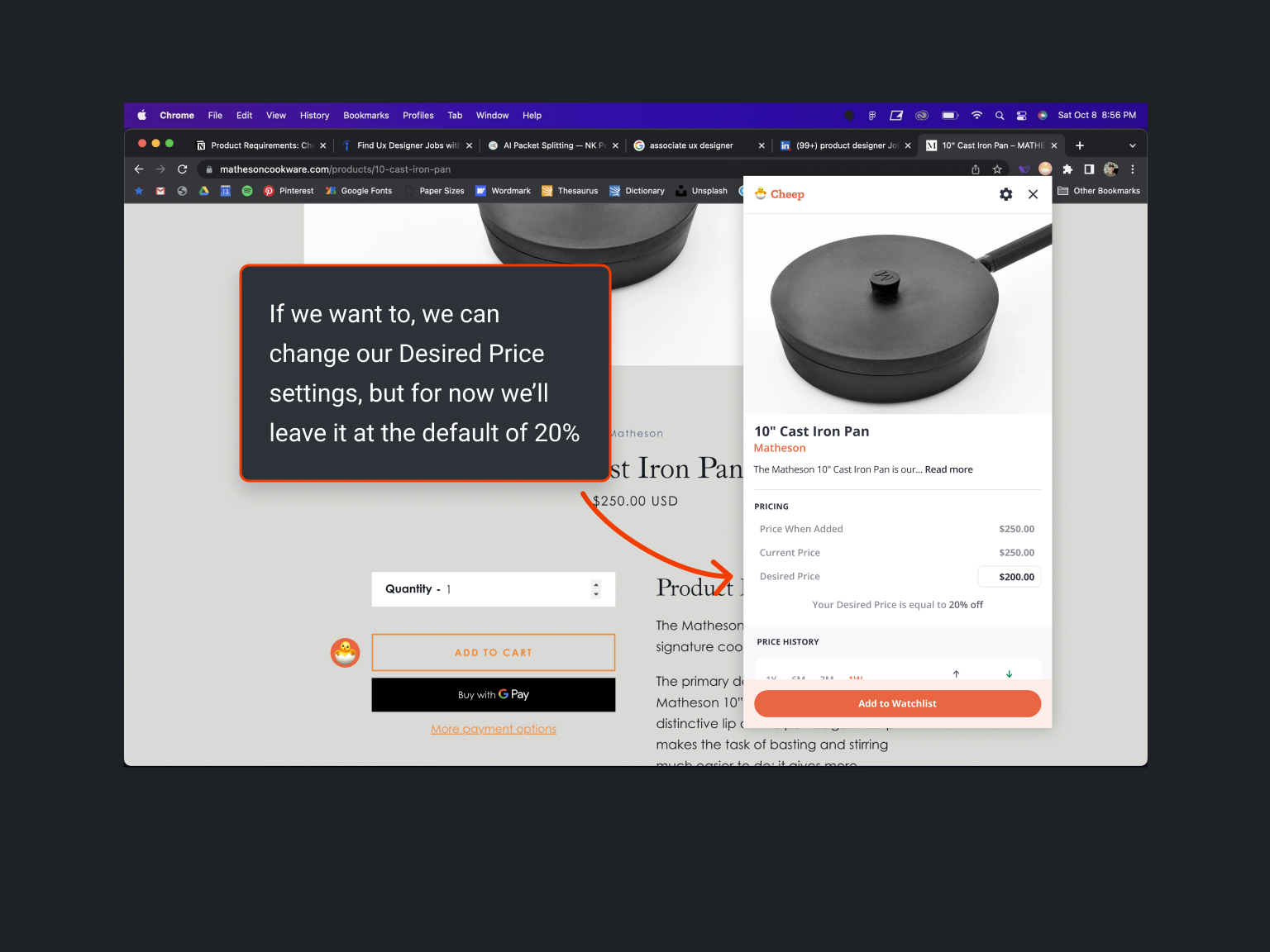
Research indicates that using higher-sounding numbers is generally more effective, especially since shoppers typically overlook percentage-based deals below 20%.
Notifying Users
Research by Patterson Dental, featured on offthecusp.com, highlights the efficiency of text message notifications:
It takes 90 minutes for a response to an average email, and only 90 seconds for a response to an average text message.
What’s more, the response rate to a text message is 8x higher than the response rate to an email.
We considered this data when we decided to prioritize text notifications, using emails as a secondary option. Offering both is crucial, as new users may be hesitant to provide their phone numbers. This concern can be addressed during onboarding by emphasizing Cheep's robust security and privacy policies.
Who are our competitors?
Early in my research, it became clear that Cheep's unique offering—shopping across multiple websites—had no direct competition in the saturated market of online shopping Chrome extensions, which mainly focus on finding coupon codes.
Among eight indirect competitors, Honey, CNET, and Capital One Shopping stood out.
Cheep is designed to fill a niche, rather than compete to offer the same suite of features as our competitors.
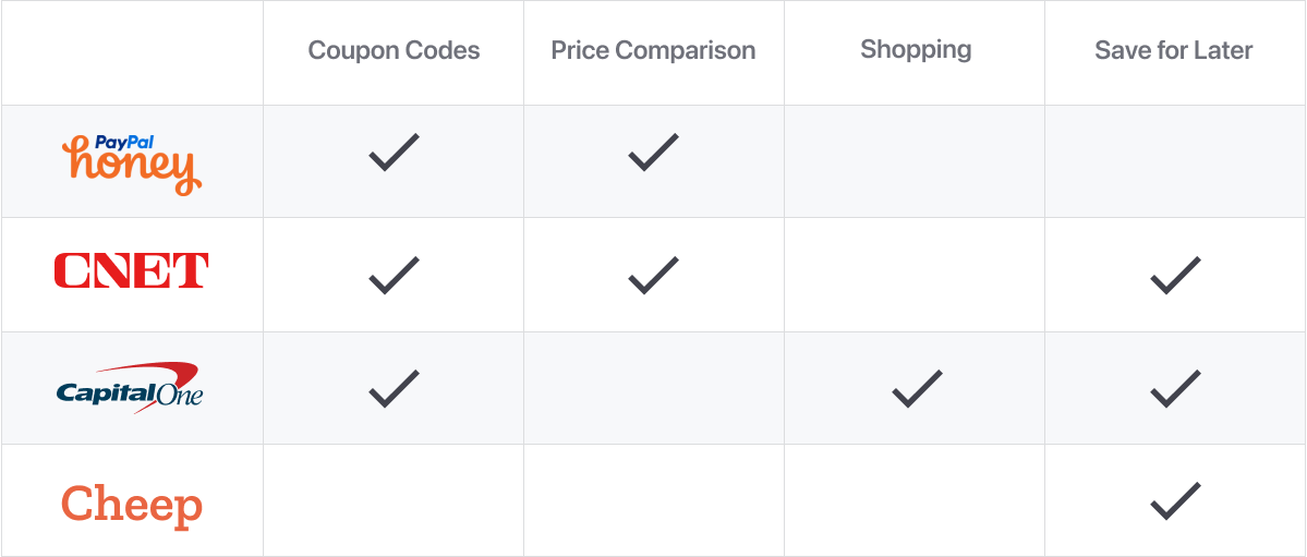
For the purposes of this case study, I’m going to walk you through my experiences with Honey and CNET.
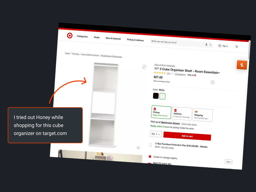
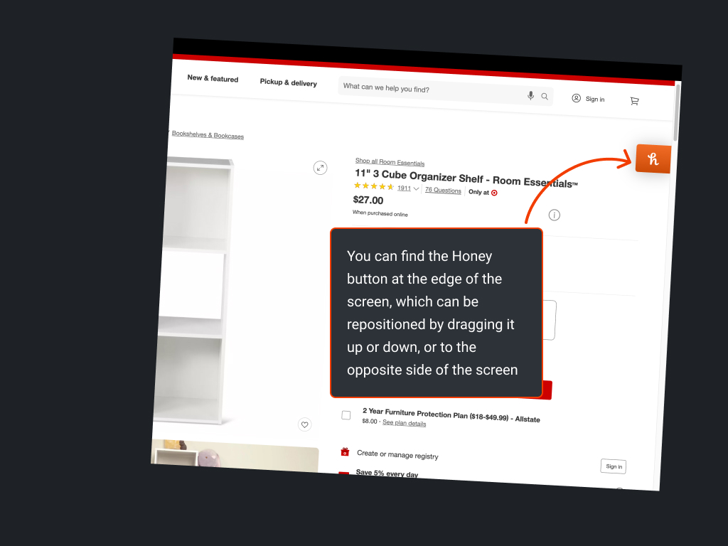
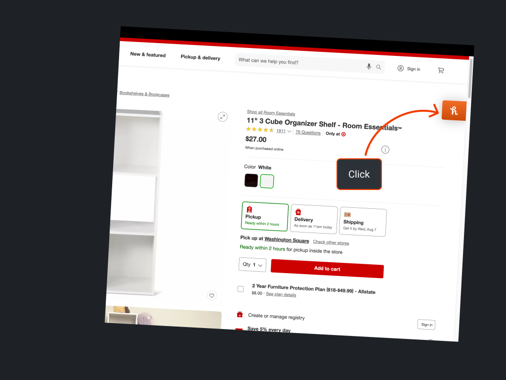
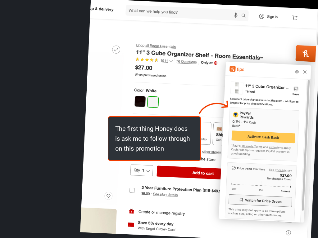
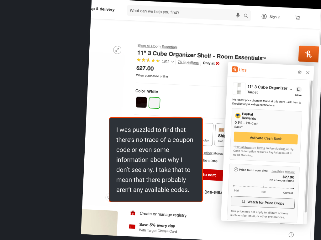
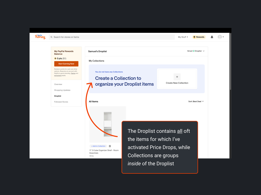
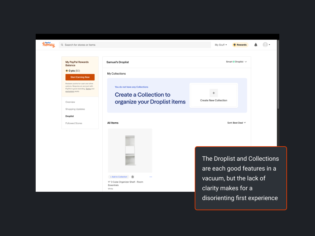
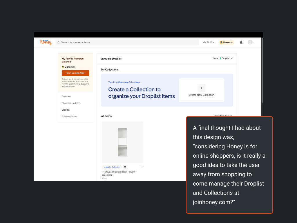
Using PayPal Honey
Honey is the leading name in the coupon code market, utilizing a vast database of coupon codes to suggest savings while you shop online.
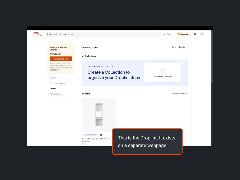
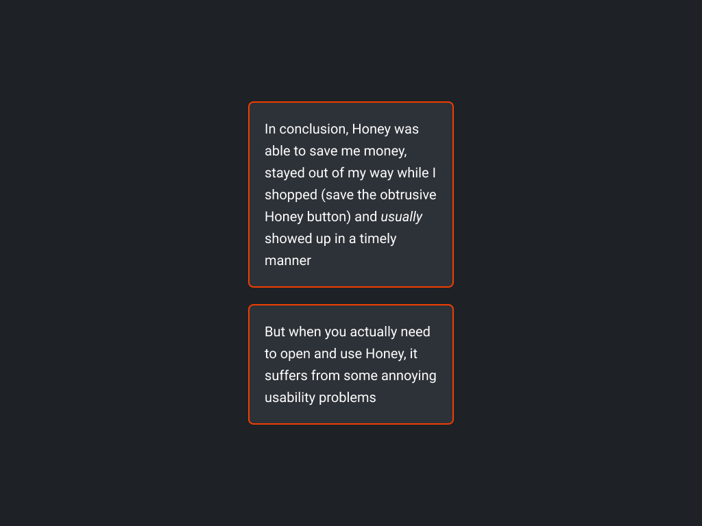
Pros
- Does a good job of finding and applying codes
- Works without much conscious effort
- Offers a useful set of features
Cons
- Poor usability
- Poor UX writing
- Poorly implemented secondary features
- Often obtrusive
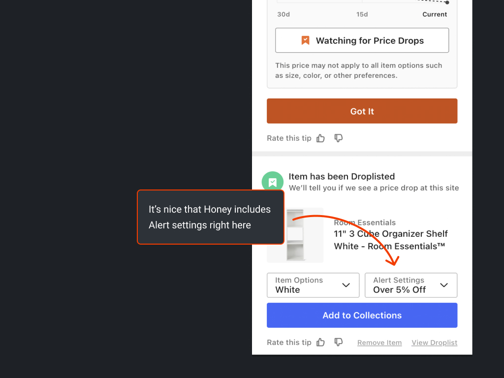
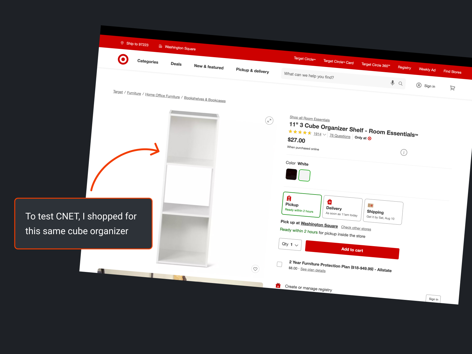
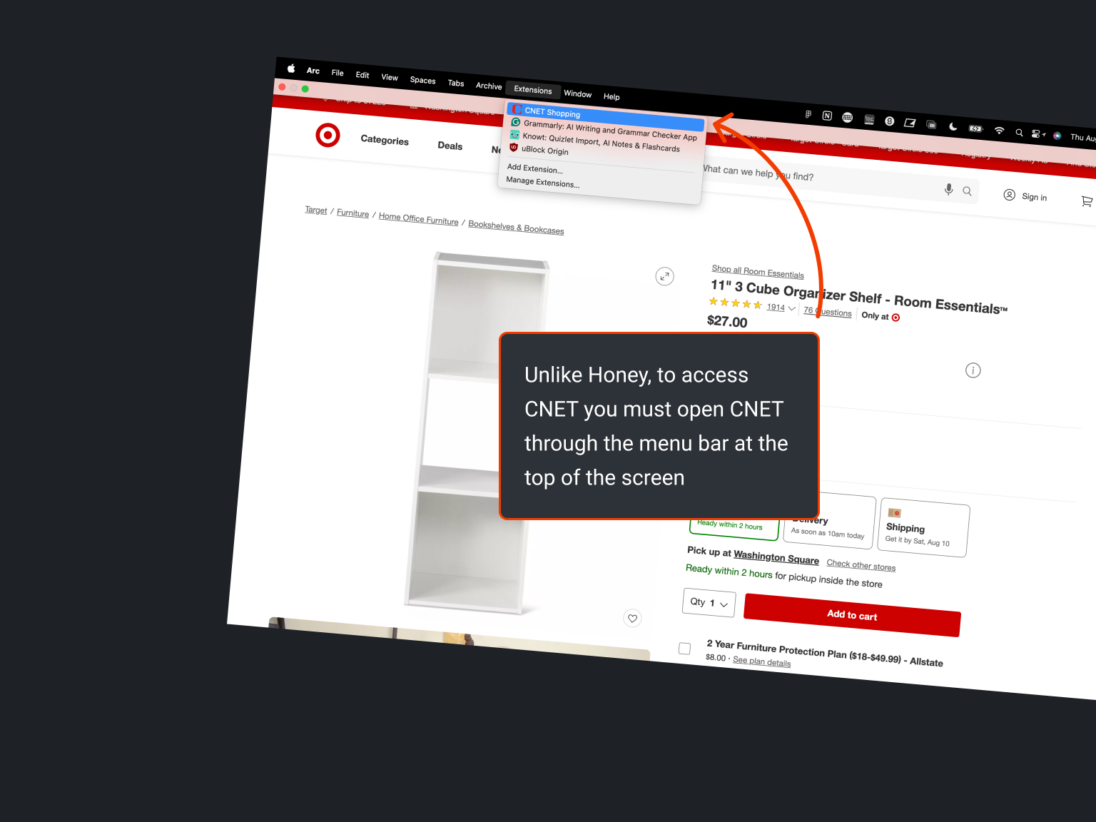
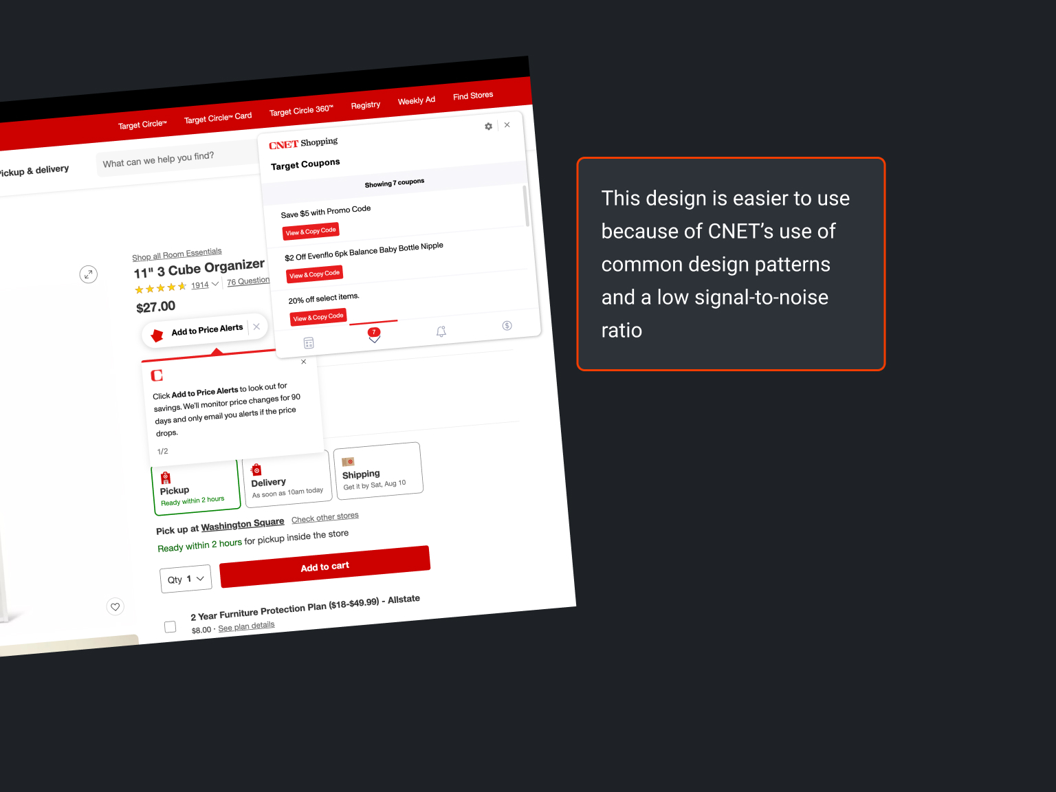
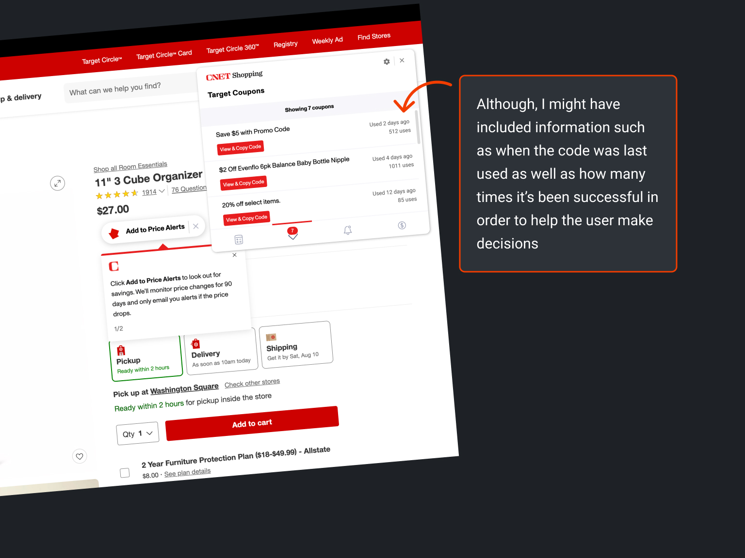
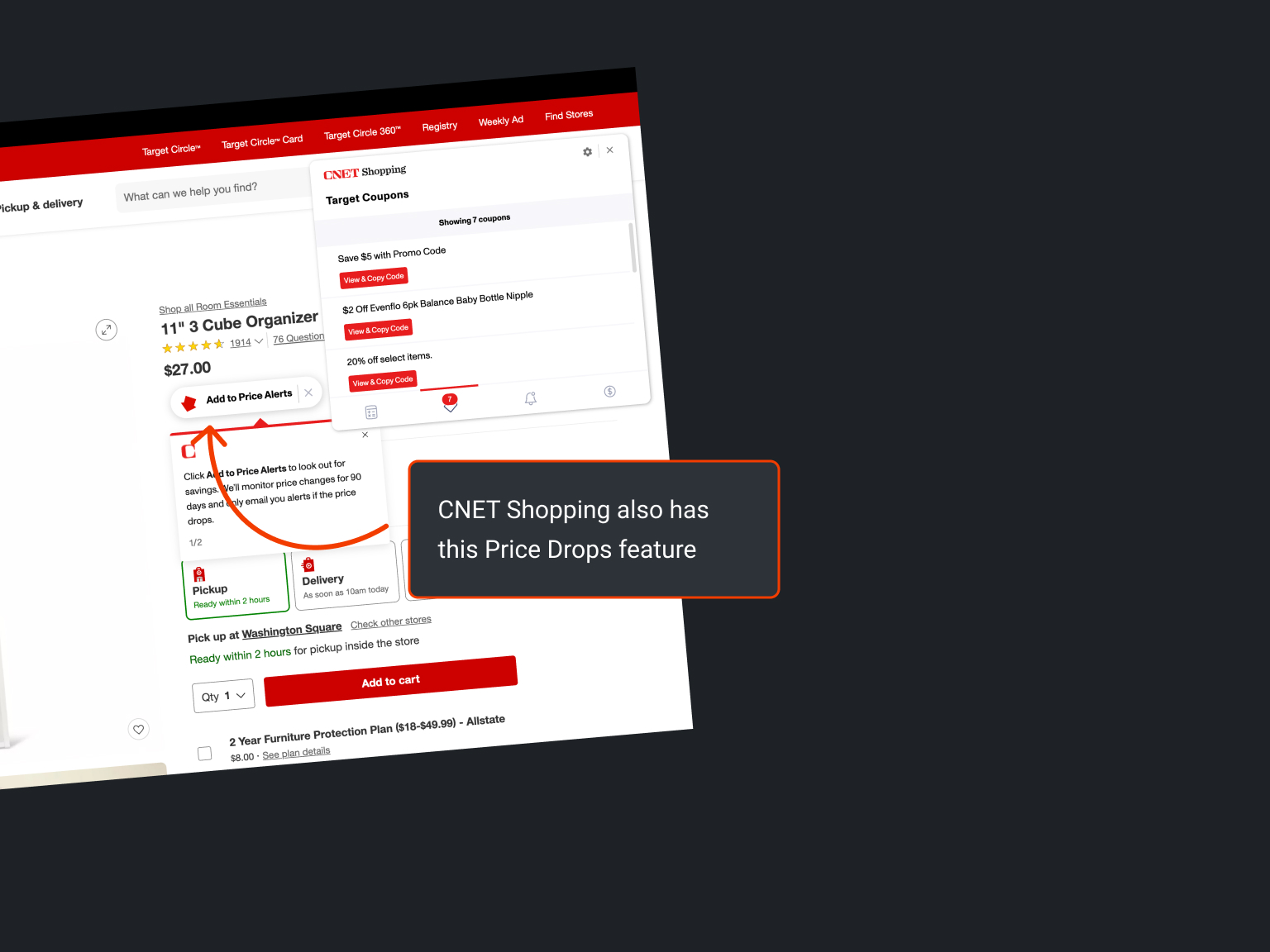
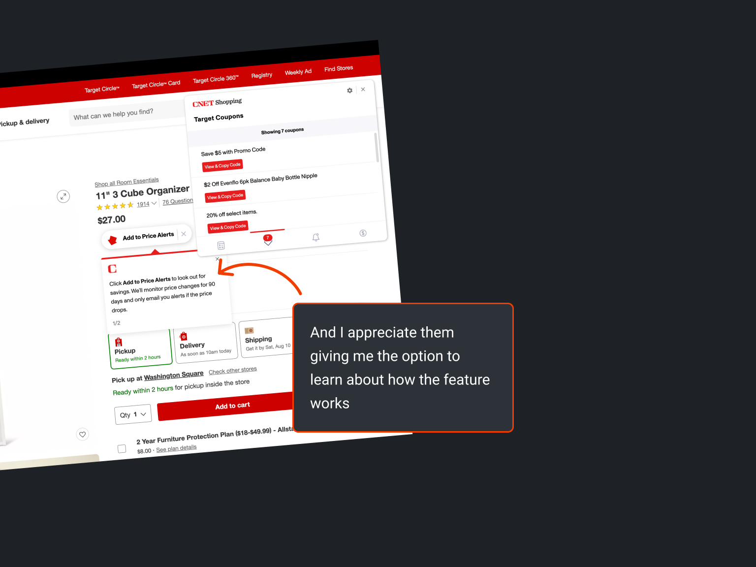
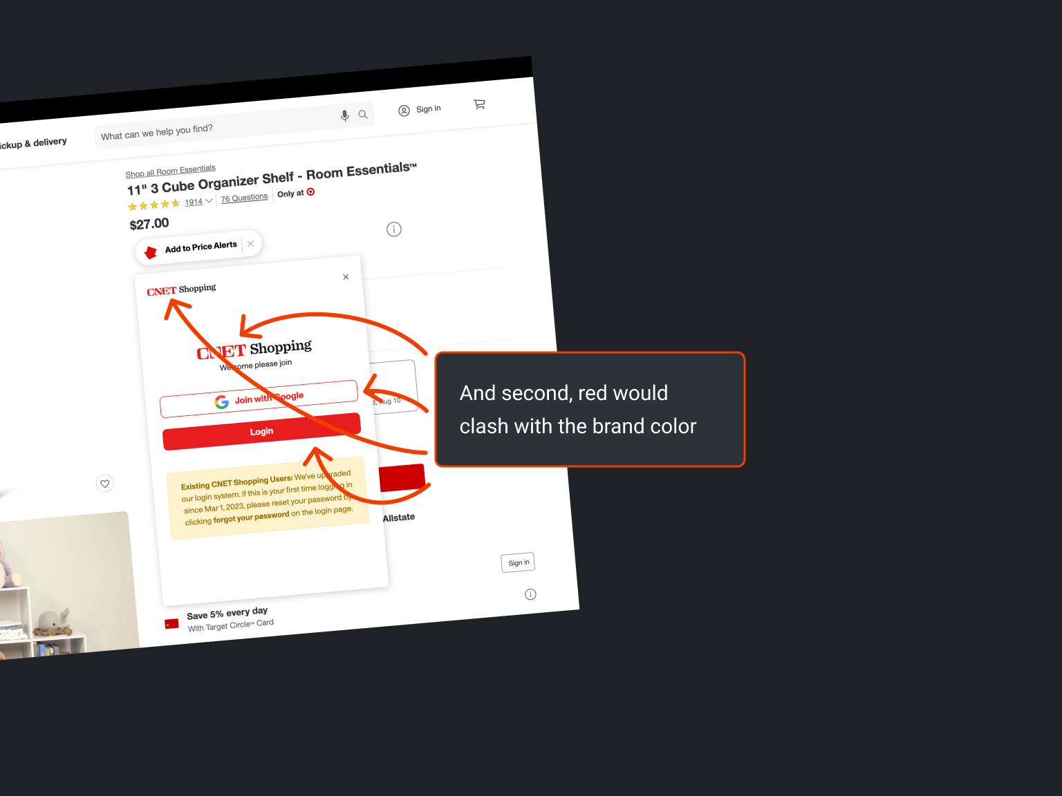
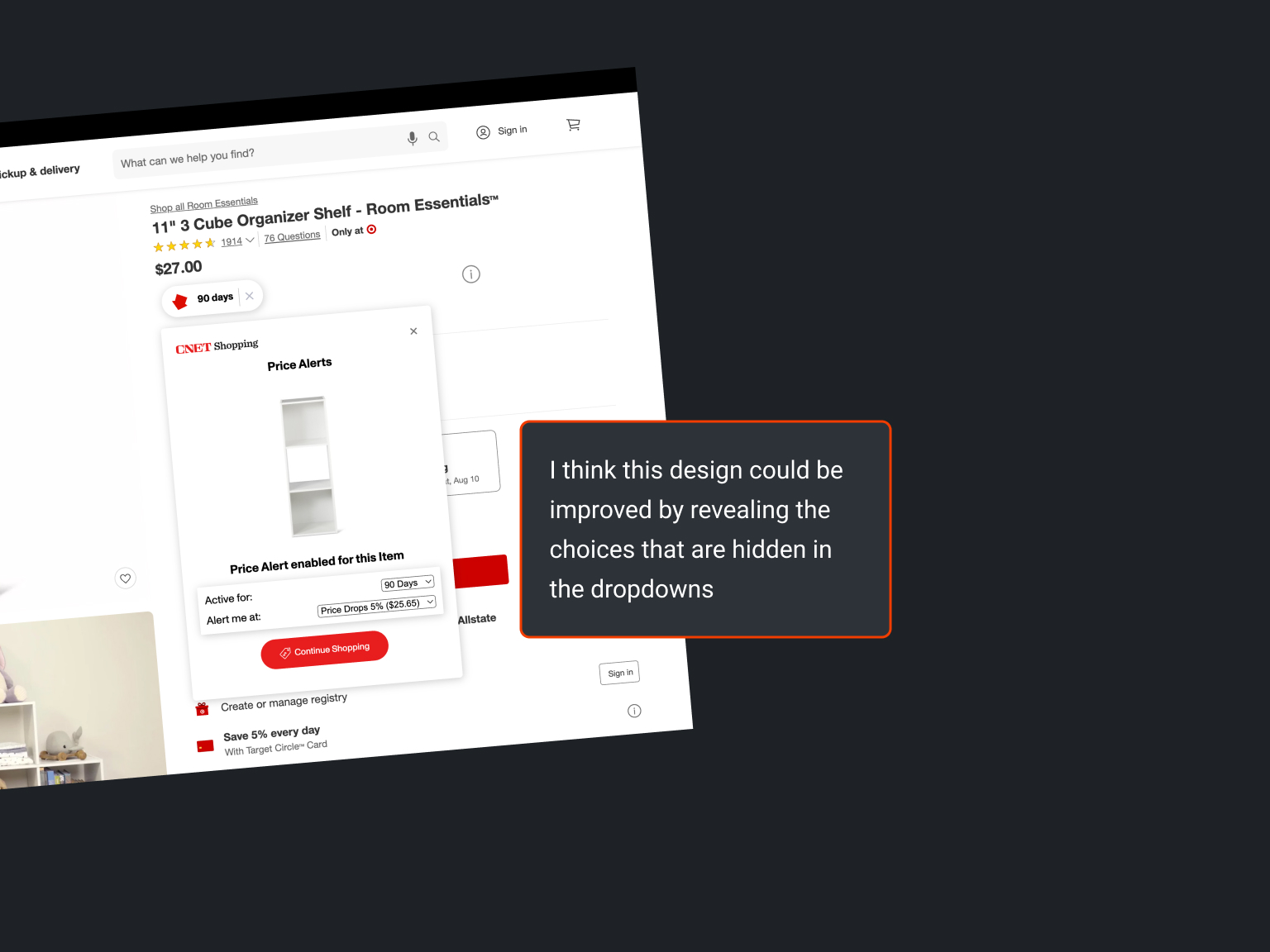
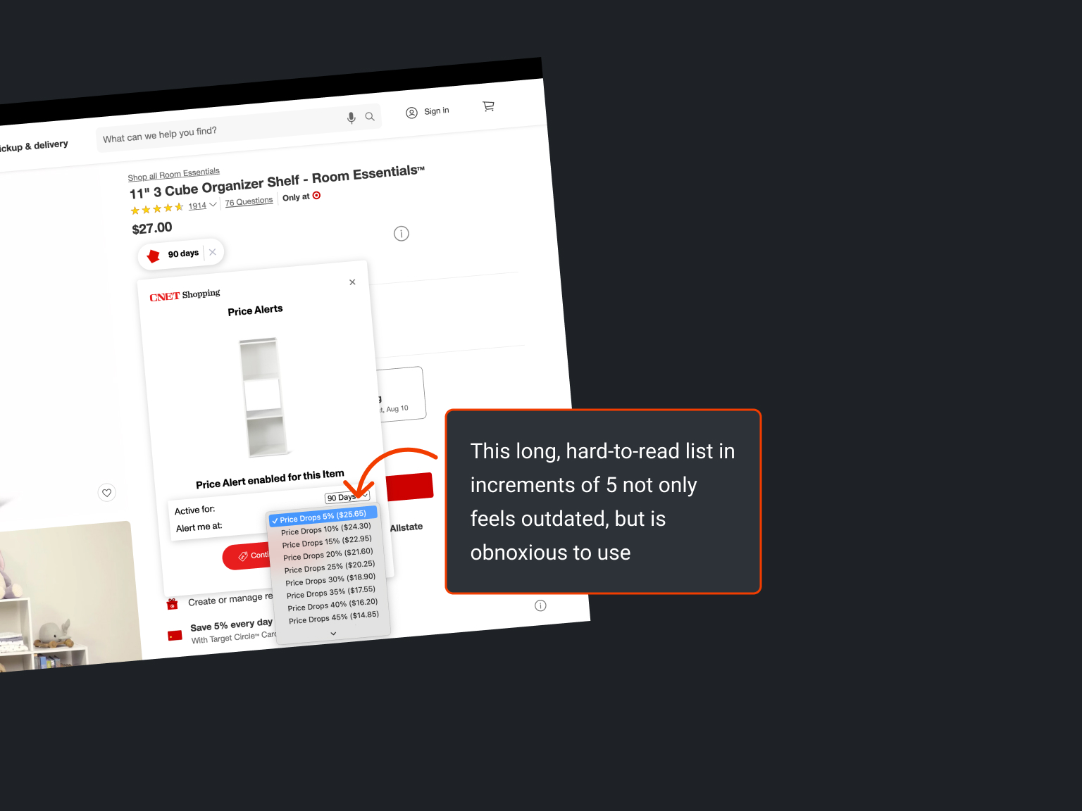
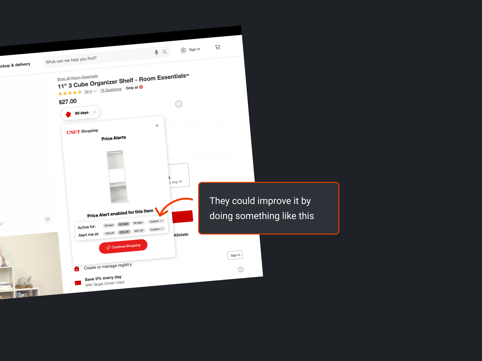
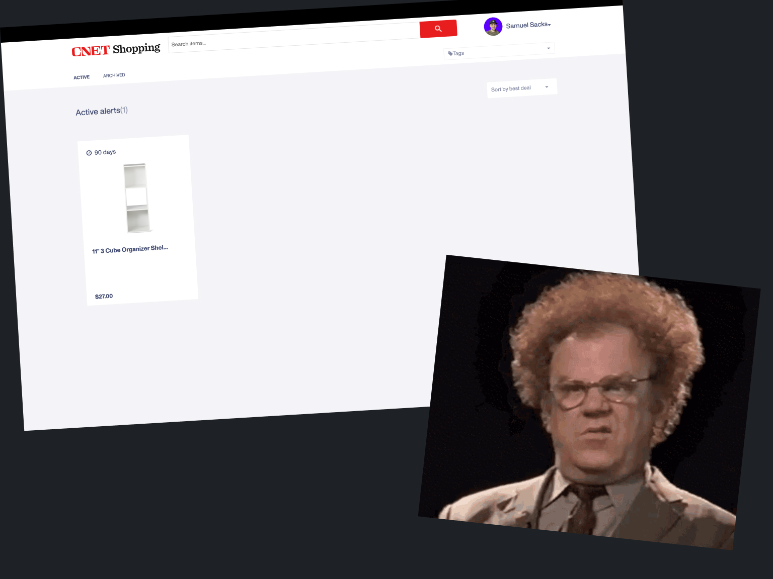
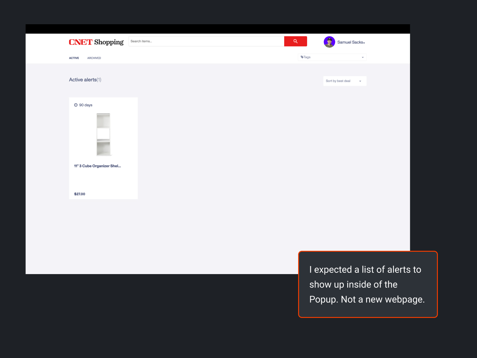
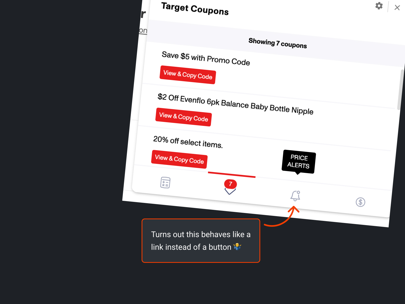
Using CNET Shopping
CNET Shopping, the second most popular product of its kind according to Google’s extension marketplace, offers features similar to those offered by Honey.

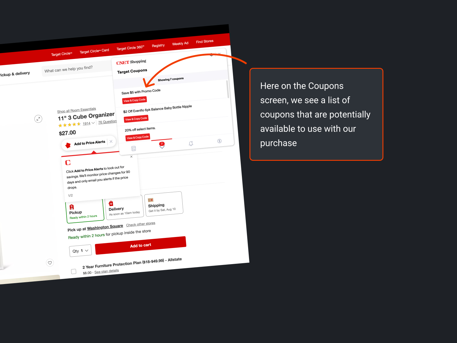
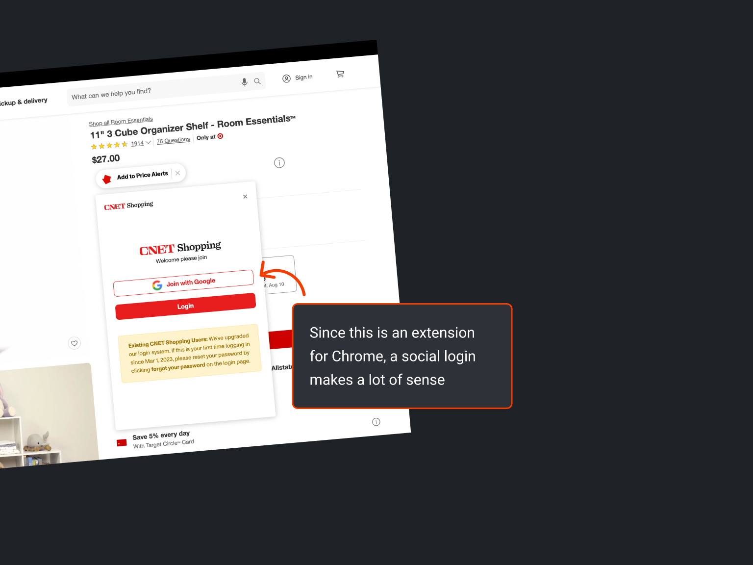
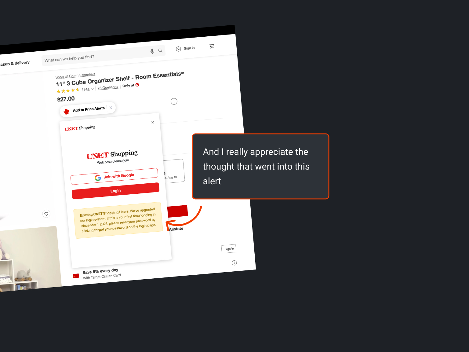

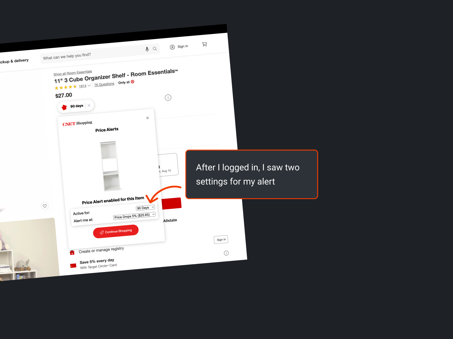
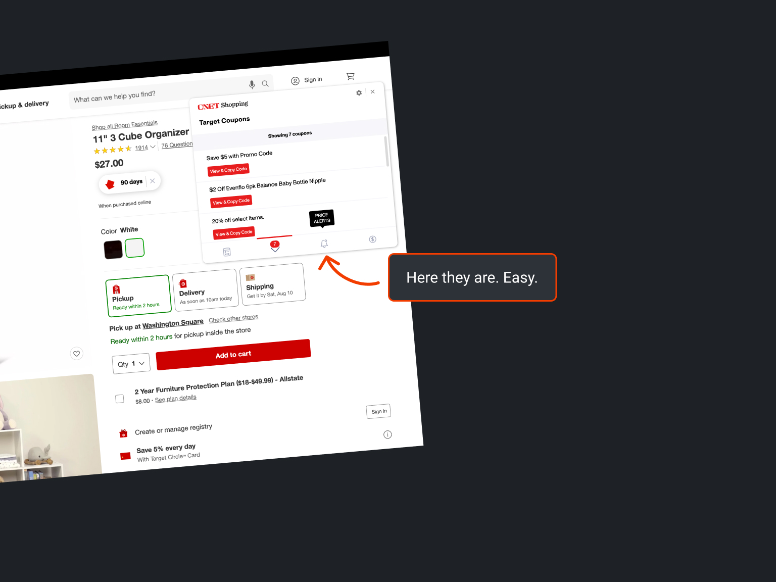
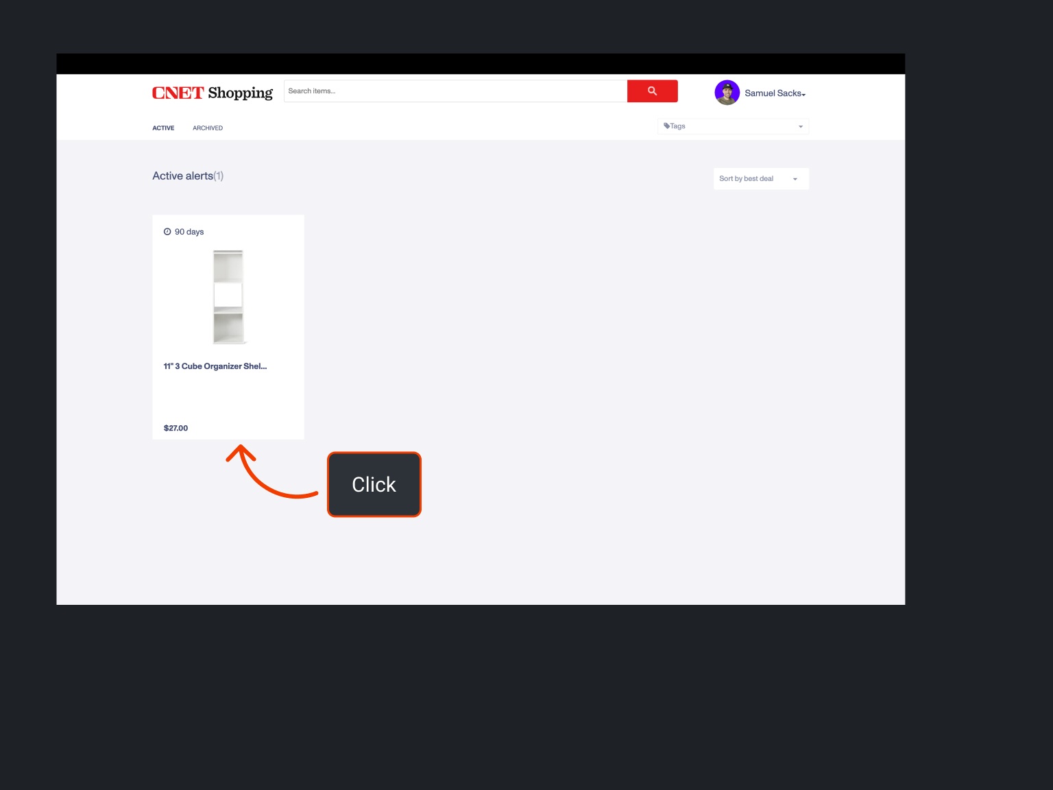
Pros
- Good usability
- Good interface design
- Offers a useful set of features
- Great implementation of features
Cons
- Sometimes cumbersome to use
- Doesn't always behave as expected
- No significant differentiation from Honey
Sketches, wireframes, and mockups
Before I began sketching, I thought about Cheep's ethos.
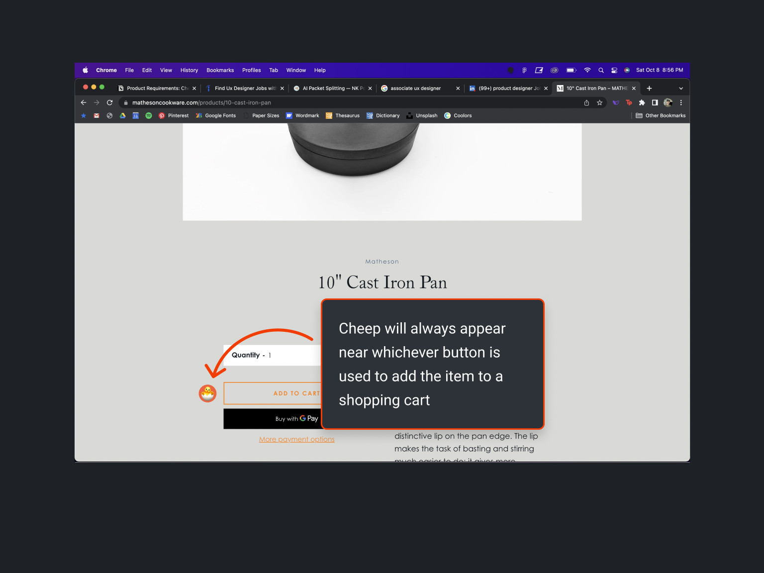
It should be just as easy to add an item to Cheep as it is to add it to your cart.
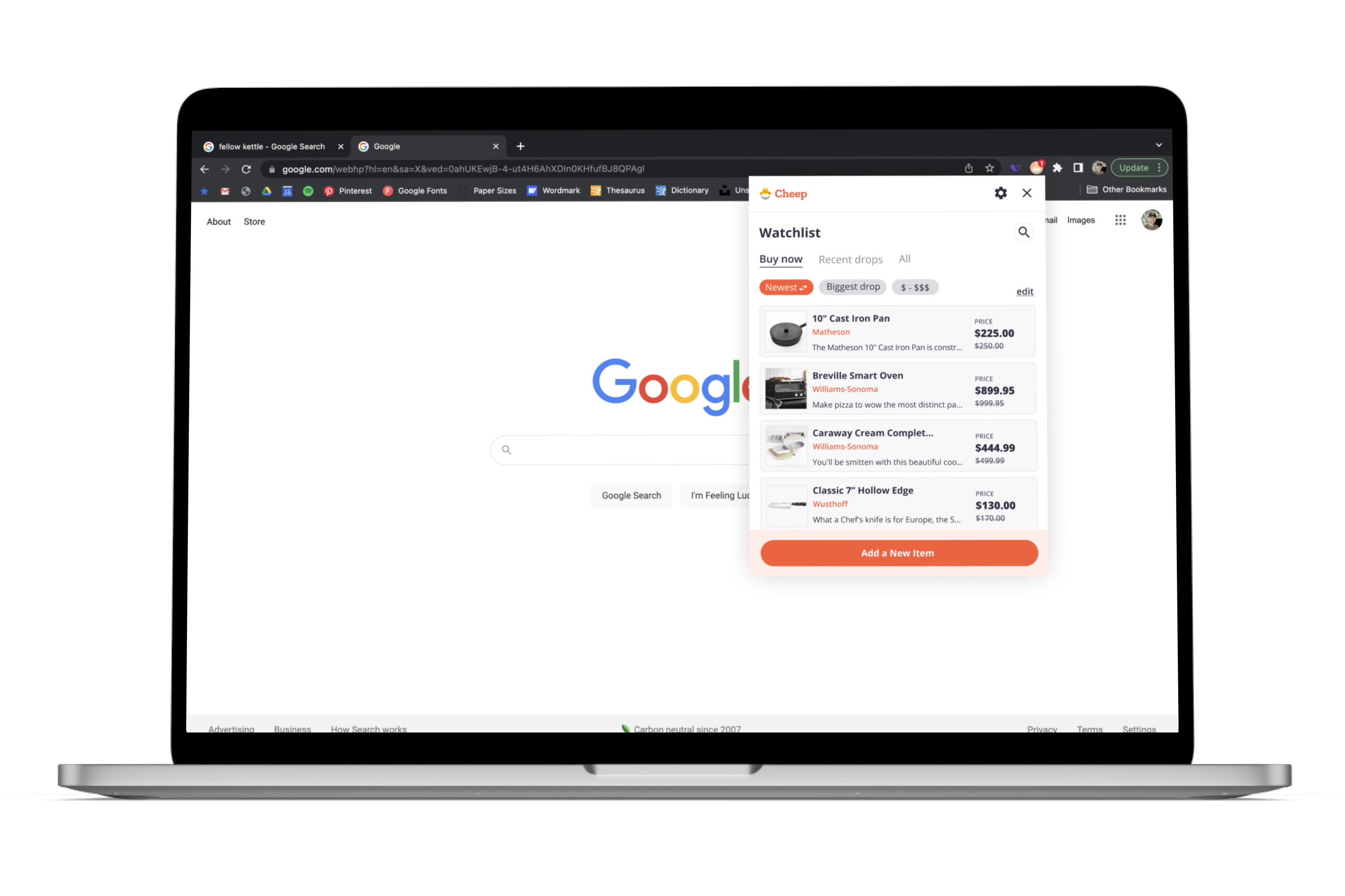
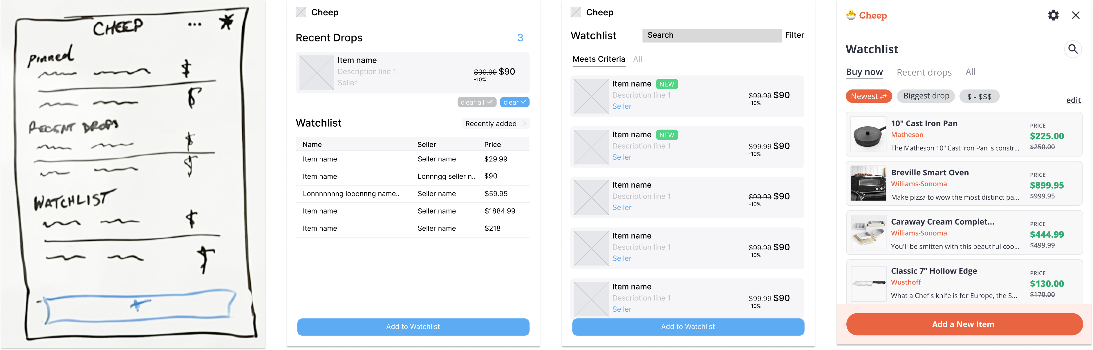
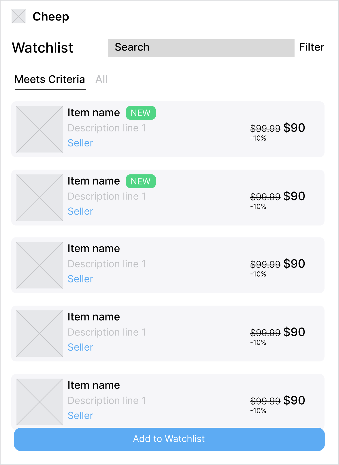
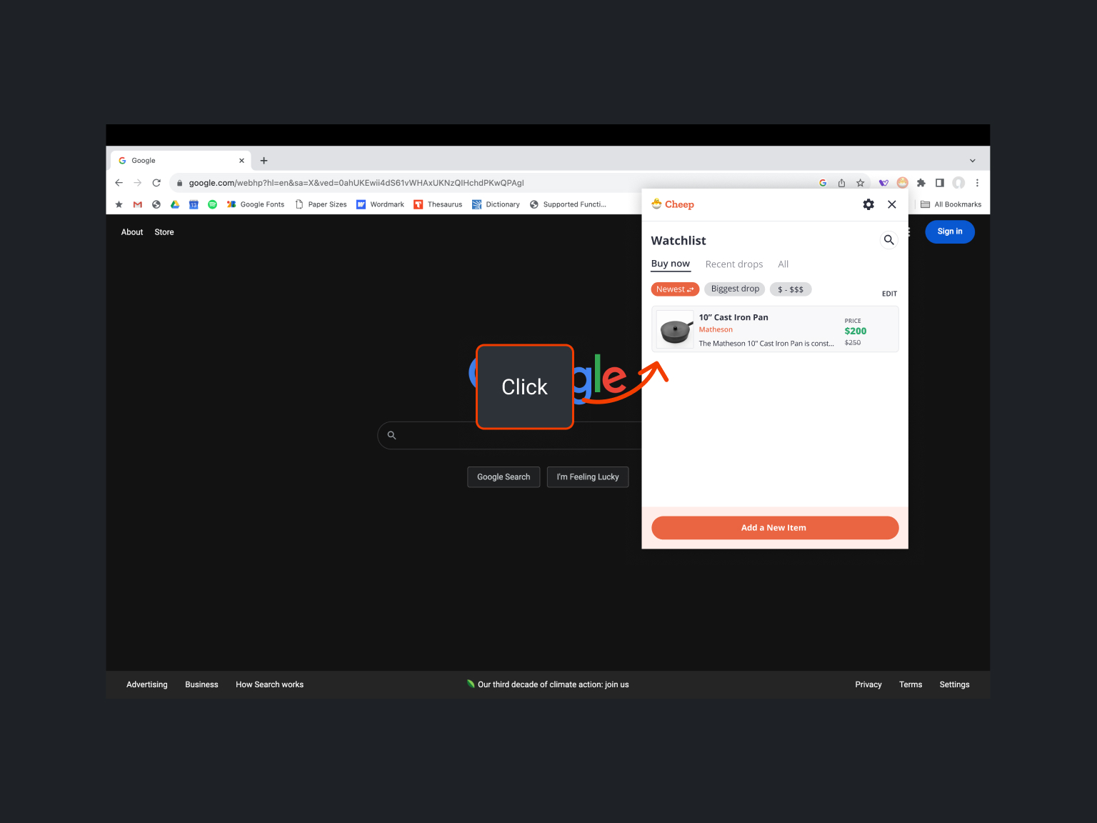
I experimented with different ways to organize the Watchlist, and which information about a product was important enough to display in Cheep.
Then I jumped into Figma.
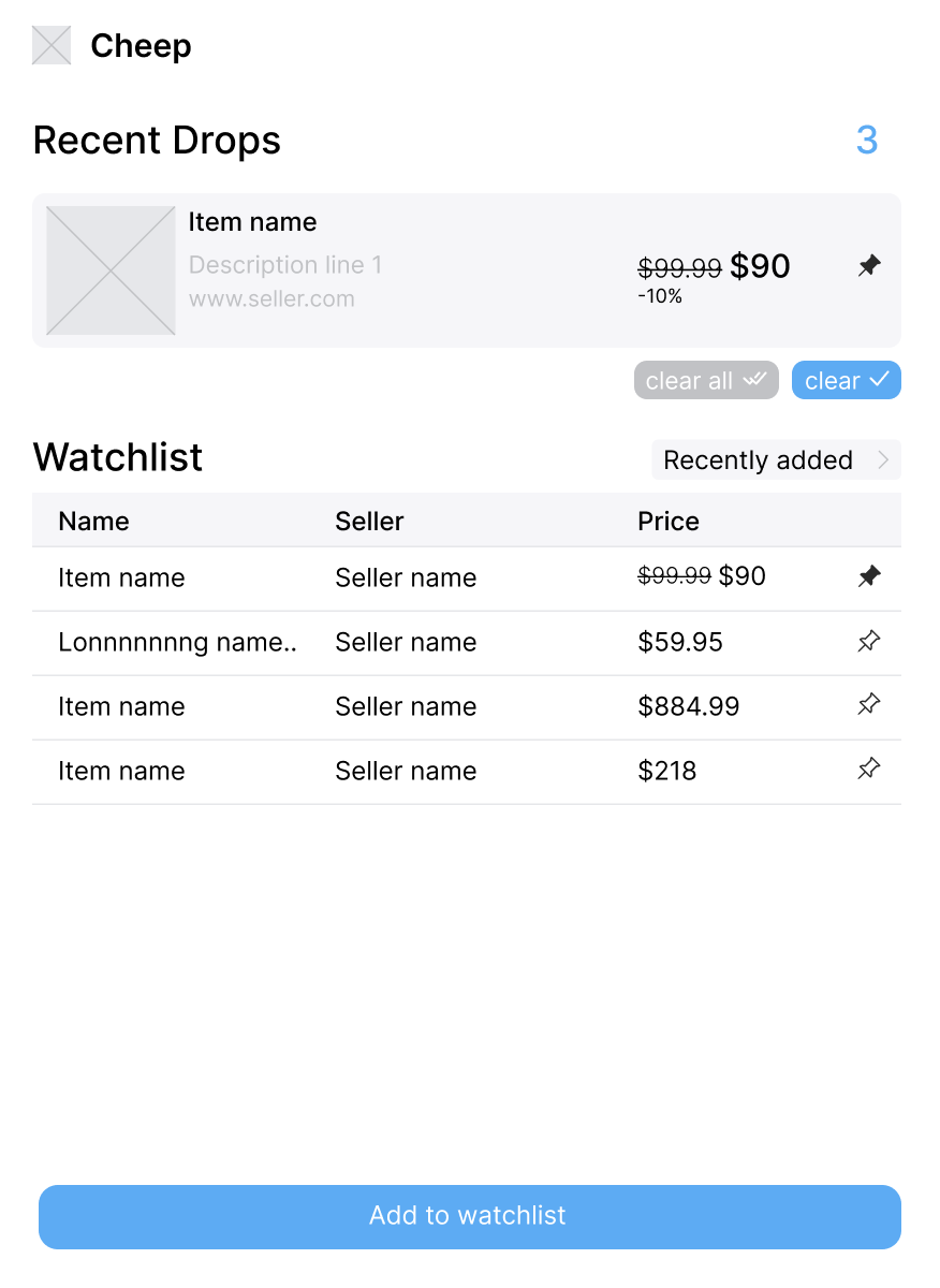
When AJ saw my designs, he criticized the format of the Watchlist (the Watchlist is effectively Cheep’s Home Screen).
“There are too many columns.”
“This feels outdated.”
“But... This container looks good. Why don’t we make the whole list look like that?”
I’m glad he pointed out the problems that he did. He let me listen in on his process as he thought aloud.
When I approached the Watchlist this next time, I internalized what AJ said about giving each element more room to breathe and reducing the amount of information on any one screen.
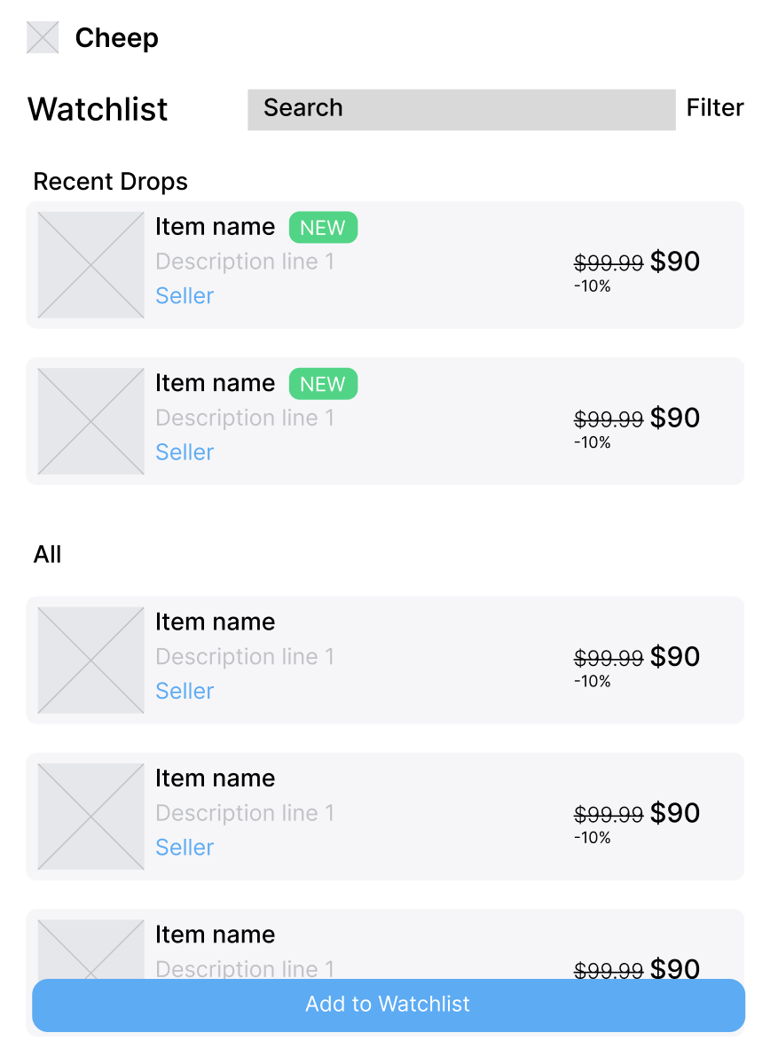
We continued to refine the design through collaborative sessions on Figma, experimenting with elements like:
- Pills to indicate status
- Tabs to separate content
- Search bar placement and styling
- Action button placement and styling
This next design more closely resembles the mockups we would design later on 👇
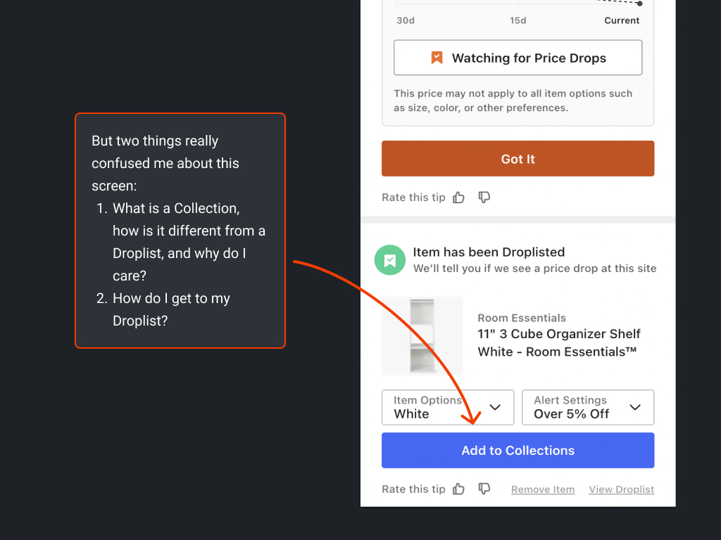
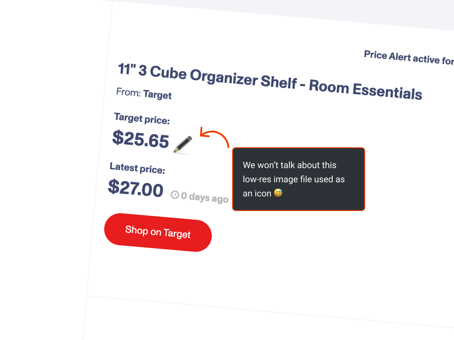
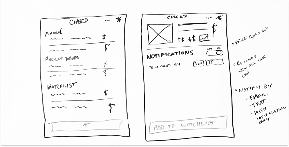
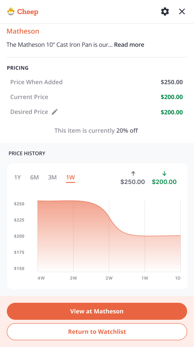
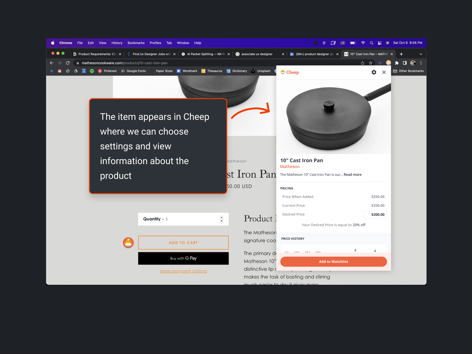
The Item Screen
Designing the Item Screen, which allows users to adjust desired prices and view price history, presented a unique challenge. I initially struggled with layout and data representation.
When I started dealing with inputs and data, the task became much more challenging. Questions swirled in my mind:
“What’s the most important element on this screen? What does the user need to do? Where should each component go? How should it look?” I felt overwhelmed.
At that time, I struggled with frustration when I made mistakes. My impatience and high expectations often led to overreacting to any failure.
The seemingly simple task became even more daunting as I felt increasingly incapable of handling it.
I remember how my teammate helped me through this.
He provided support when I was hard on myself and guided me past the obstacles.
I frequently sought his feedback and advice, and his patience and encouragement not only improved my designs but also boosted my confidence as a designer.
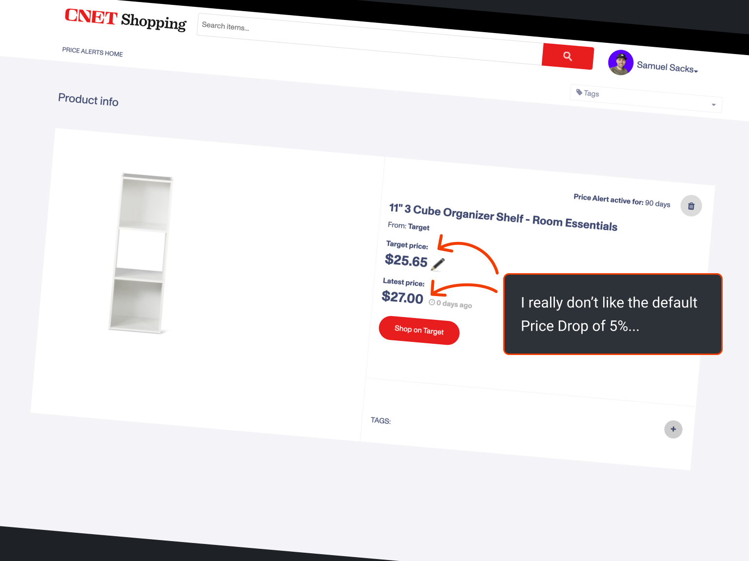
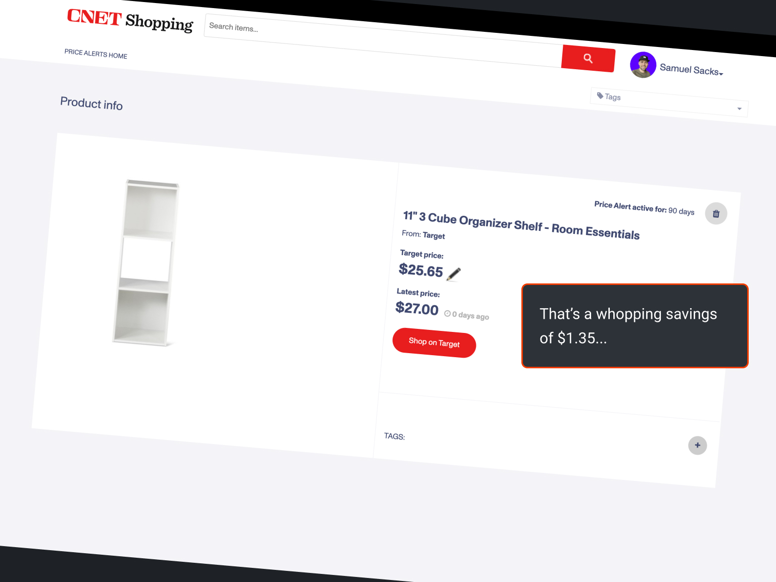
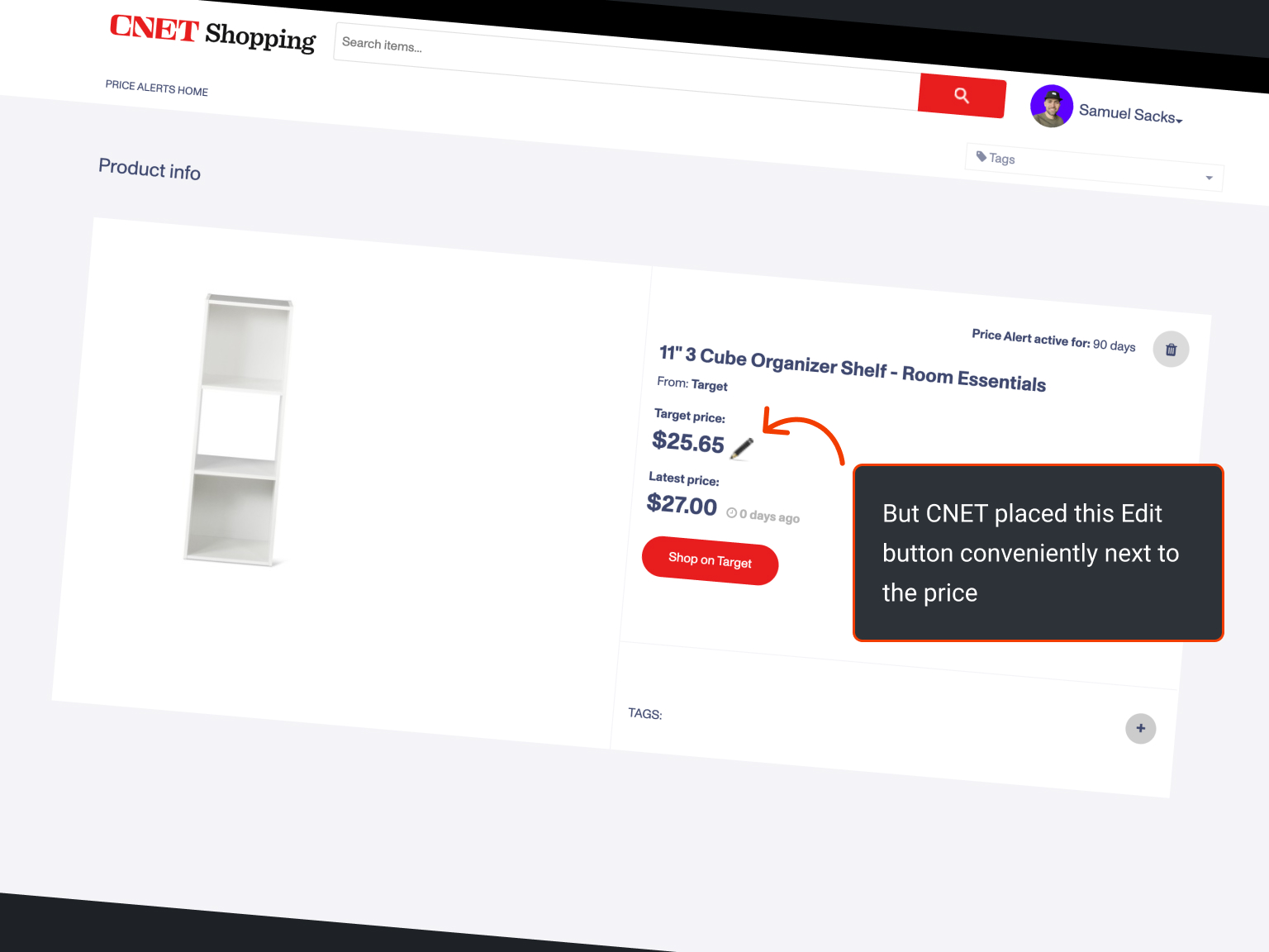
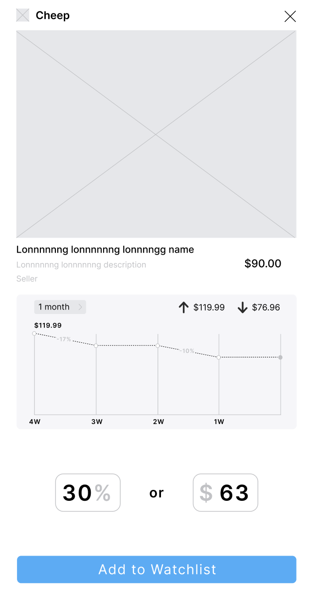
There were 2 obstacles that gave us trouble while redesigning this screen. The first was how we should go about improving the layout. The other was how to use graphs to represent data:
Improving the layout of the Item Screen
In the current state, this layout is appealing and even effective. The problem, however, was that we found it difficult to fit any supplementary information into this space, most importantly changes in prices and status.
This horizontal arrangement is too tight. After so many experiments, we decided it was necessary to change our approach.
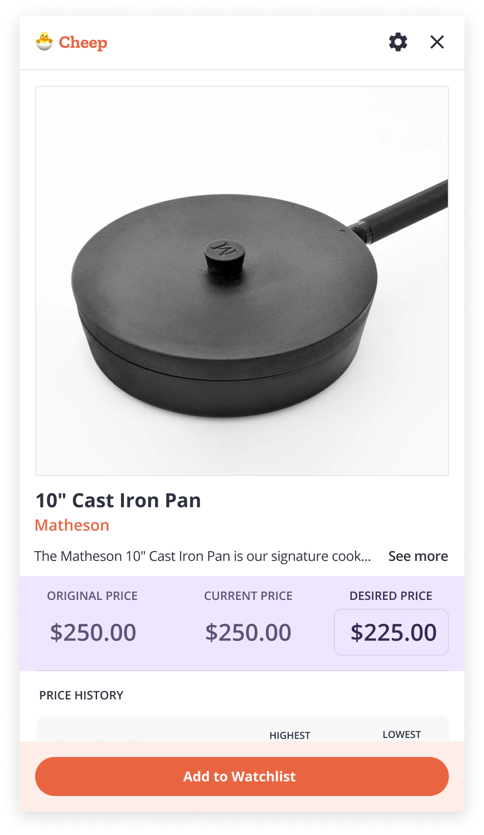
- We created a new section called Pricing
- We switched from a horizontal arrangement to a vertical one
- We reduced the size of the image so that more information could fit above the fold
And after some discussion, we refined it further
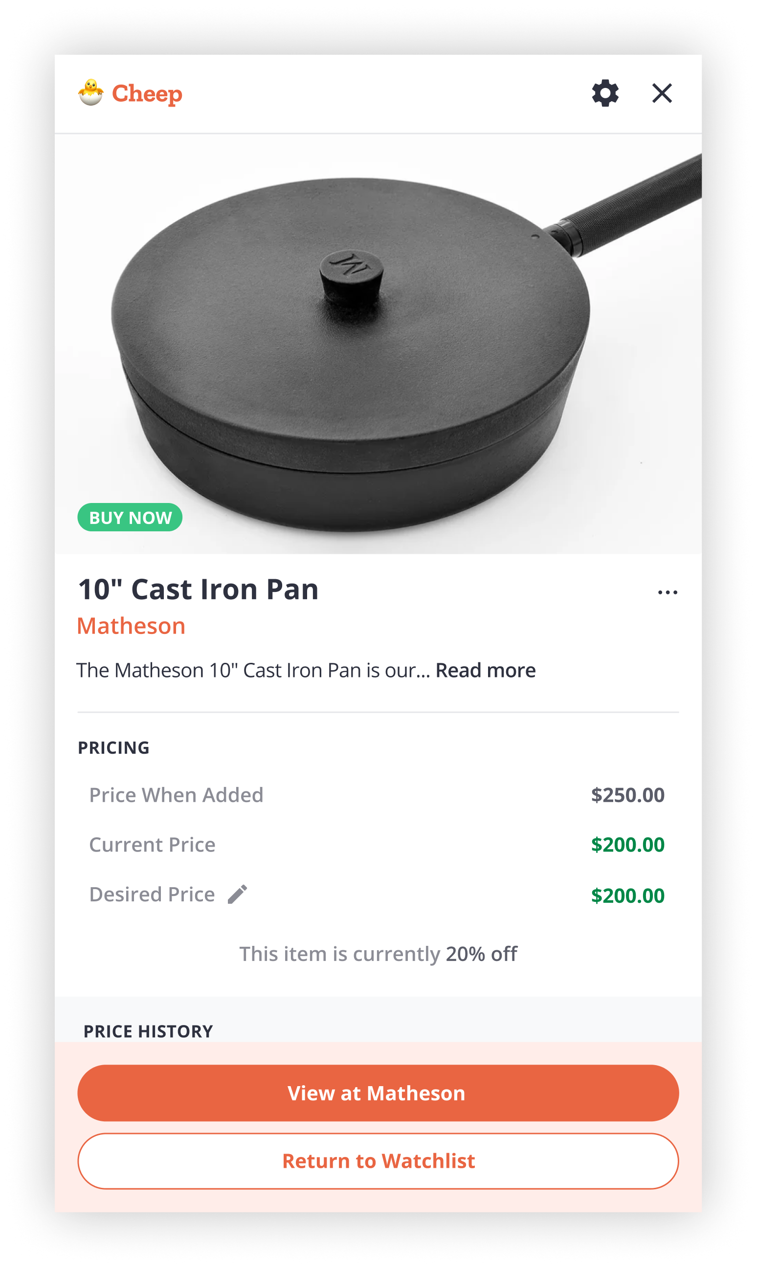
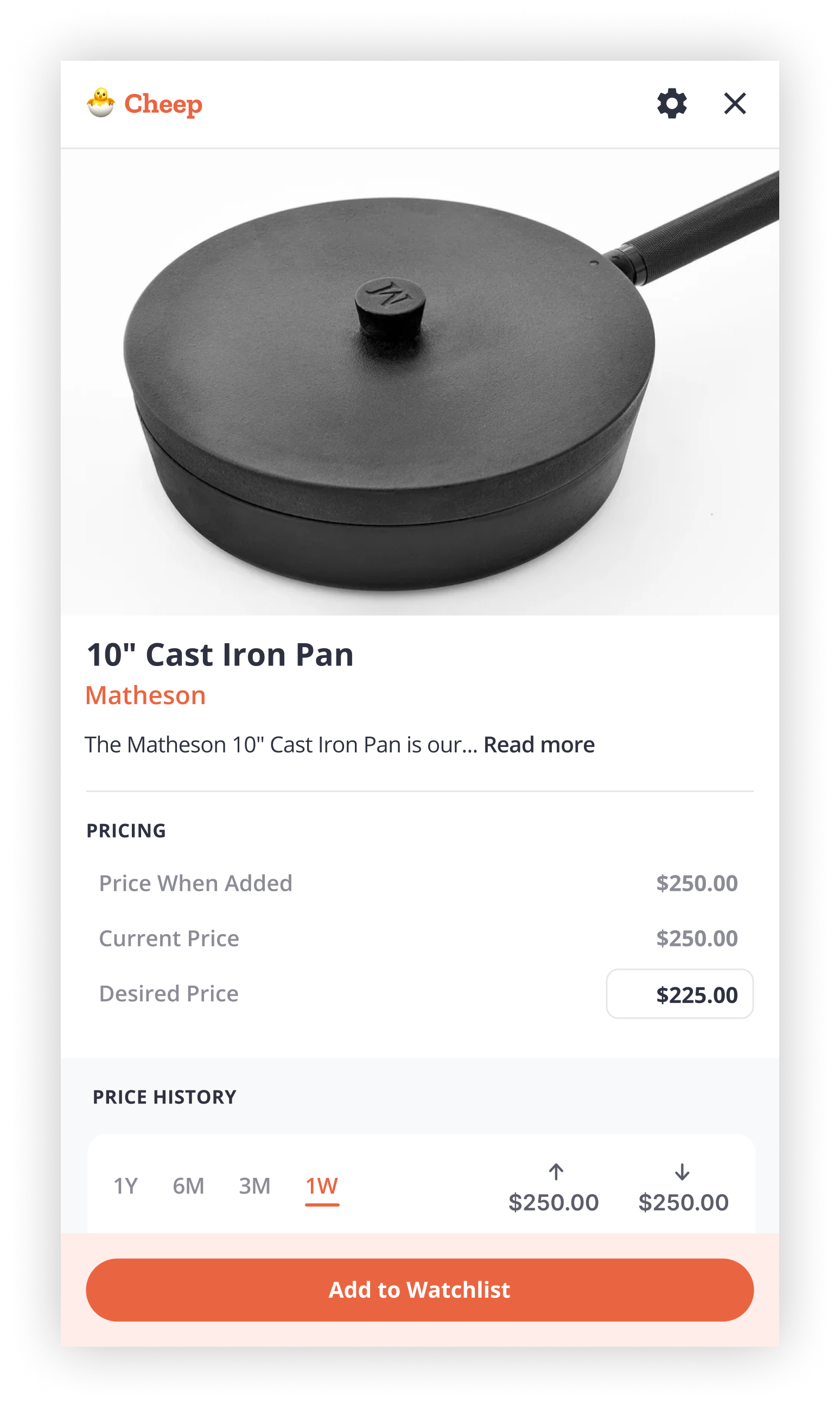
- We used new system colors to indicate price changes
- We added a Buy Now pill for accessibility and to avoid relying solely on color
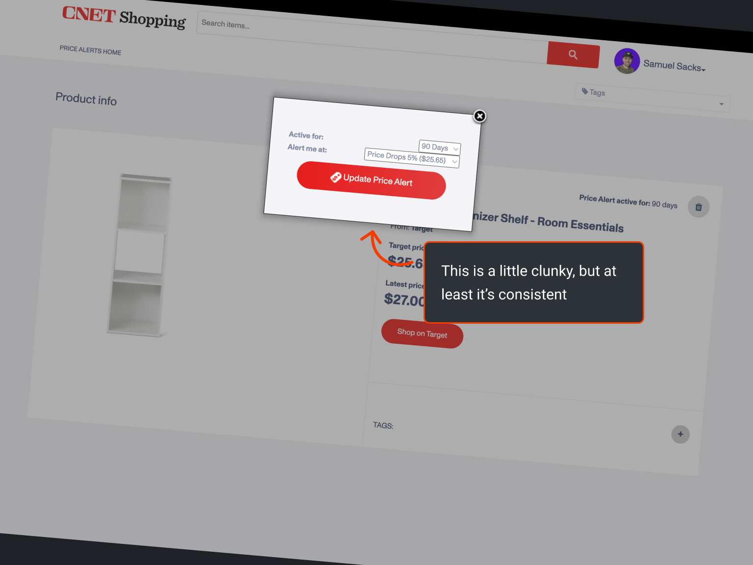
- We added a 3-dot menu where the delete button lives
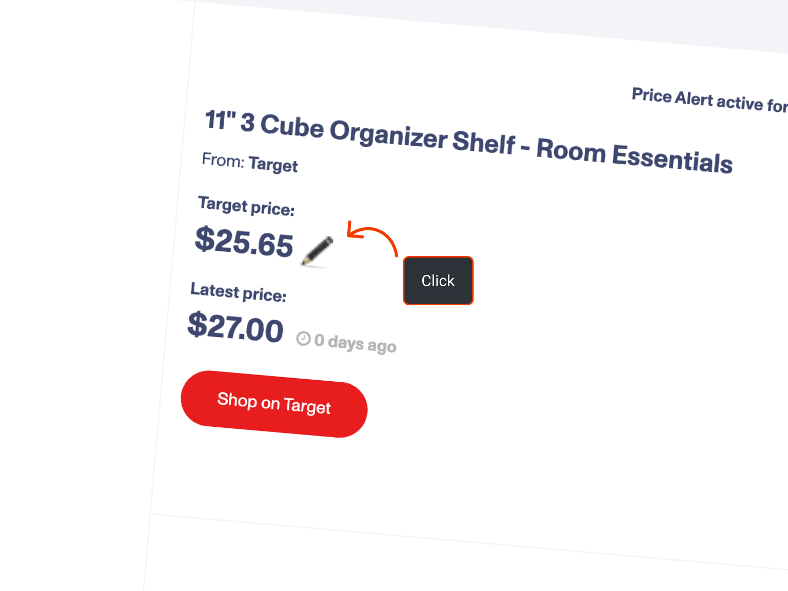
- We added an Edit button inline with the Desired Price
- We added an alert at the bottom of the Pricing section to reiterate value
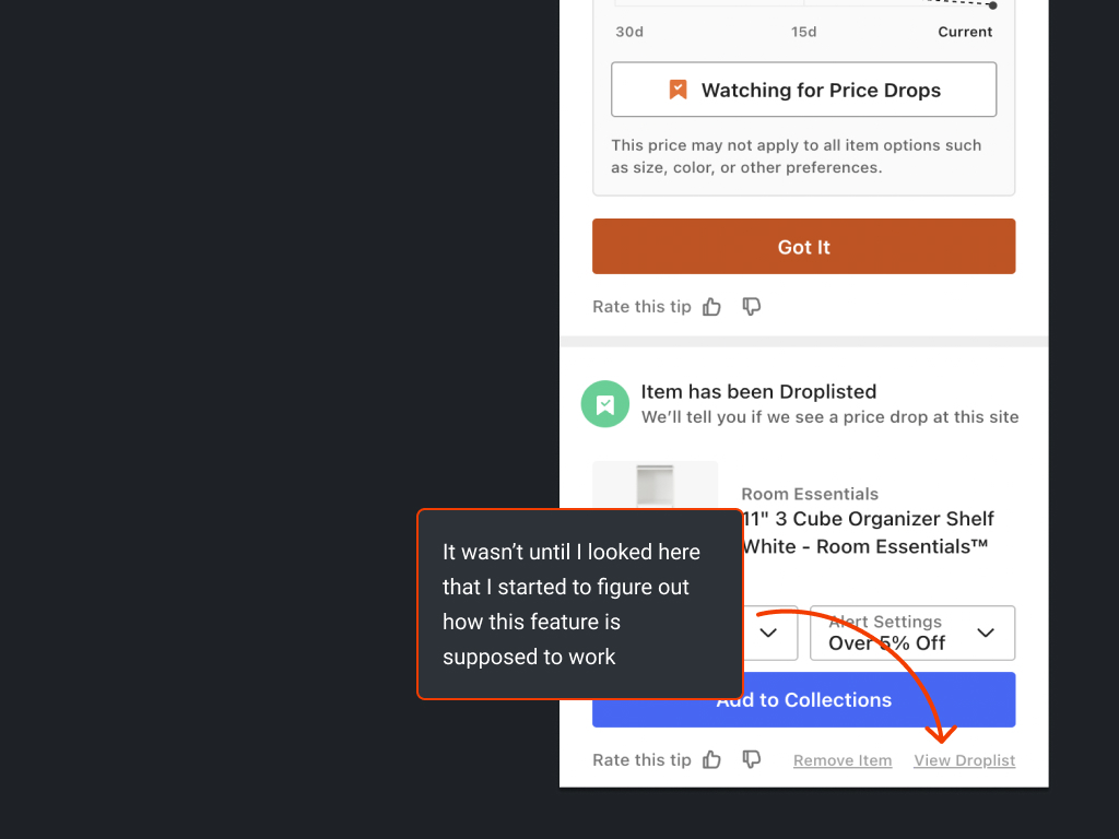
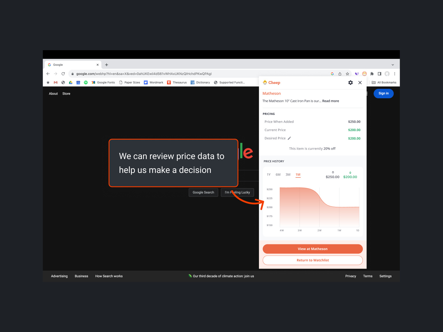
Using graphs to represent data
Considering it was my first pass, I have to say the graph turned out quite well. In fact, AJ liked it so much that we didn’t make any serious changes to its design.
The graph’s purpose is to display the history of sell prices over time. You can adjust the view in the upper-left corner, see all-time highs and lows in the upper-right, and view the main chart at the bottom.
The initial visual worked like a 1990 Civic: functional but not particularly stylish. I needed guidance on proper styling.
I struggled with decisions about label prominence and accessibility. Should the labels be as accessible as other text, or was this an exception? And what about color? How much should we use? What about the grayscale and system colors? What about the brand? I was unsure.
So, I watched AJ build an example while he thought aloud. This insight into his process made his results seem more attainable for someone at my skill level. By the end of the session, we had created a stunning little graph.
It looked right at home on the screen. And it was dead simple to understand and use.
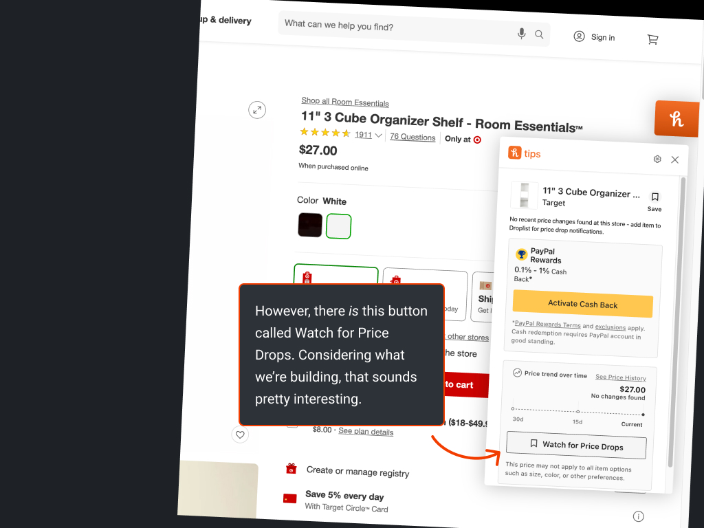
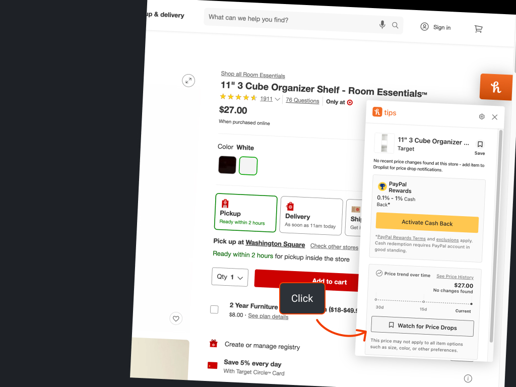
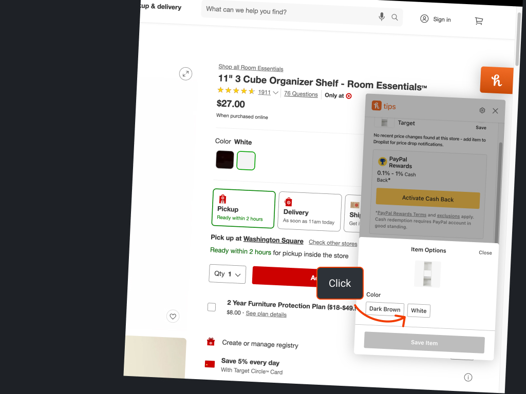
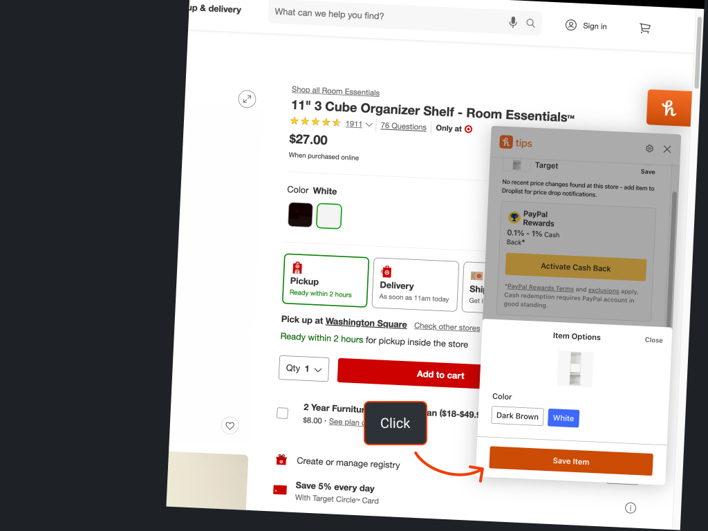
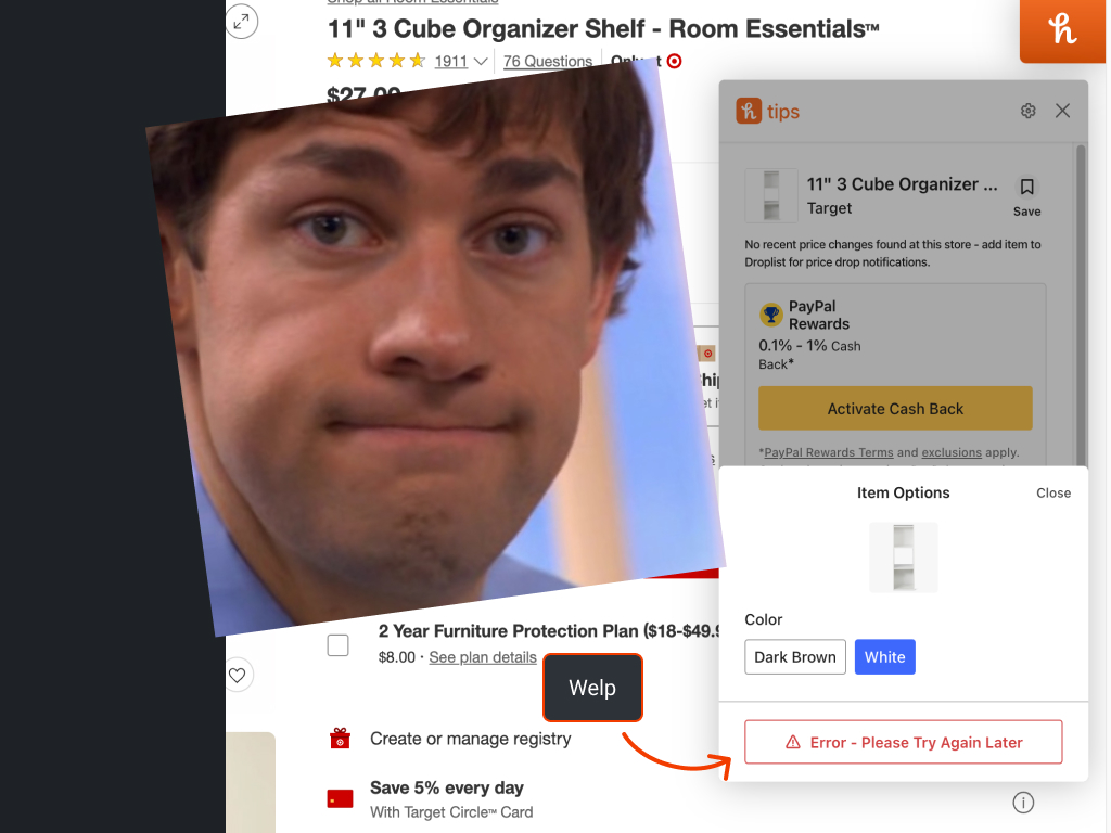
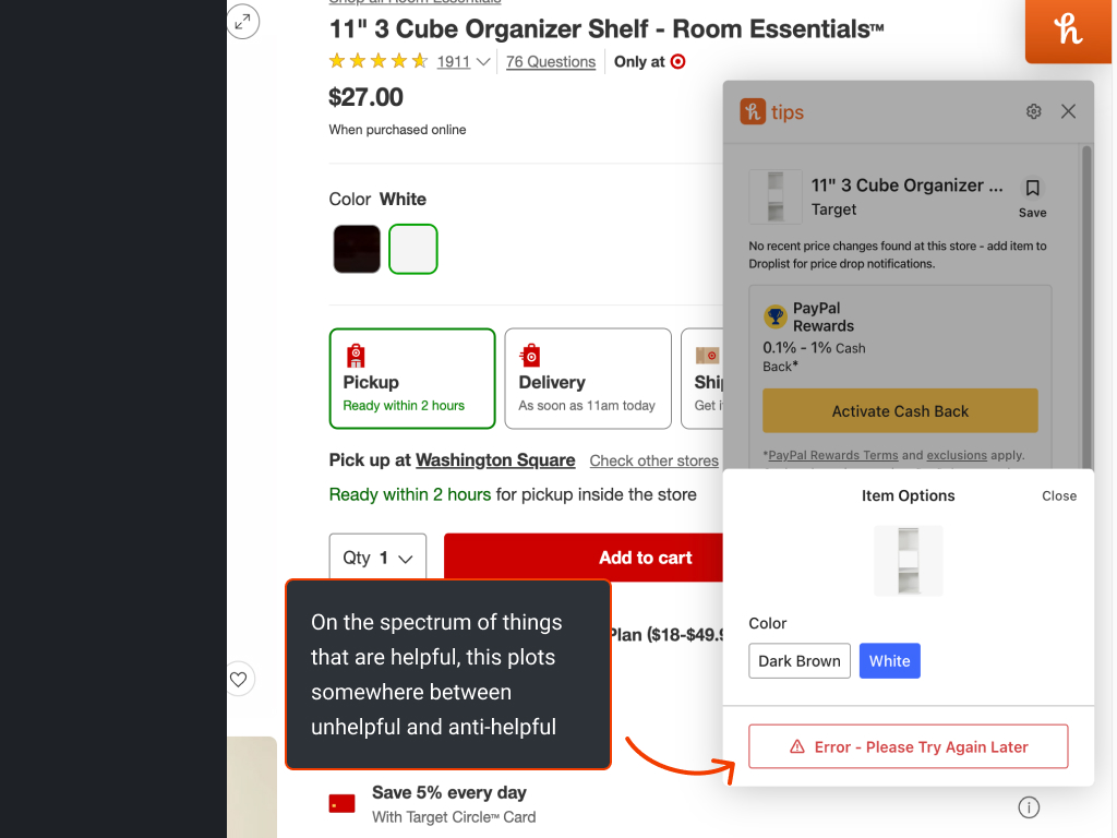
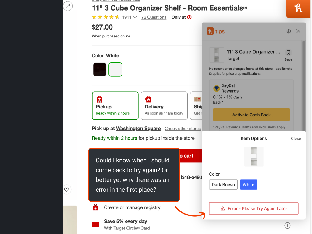
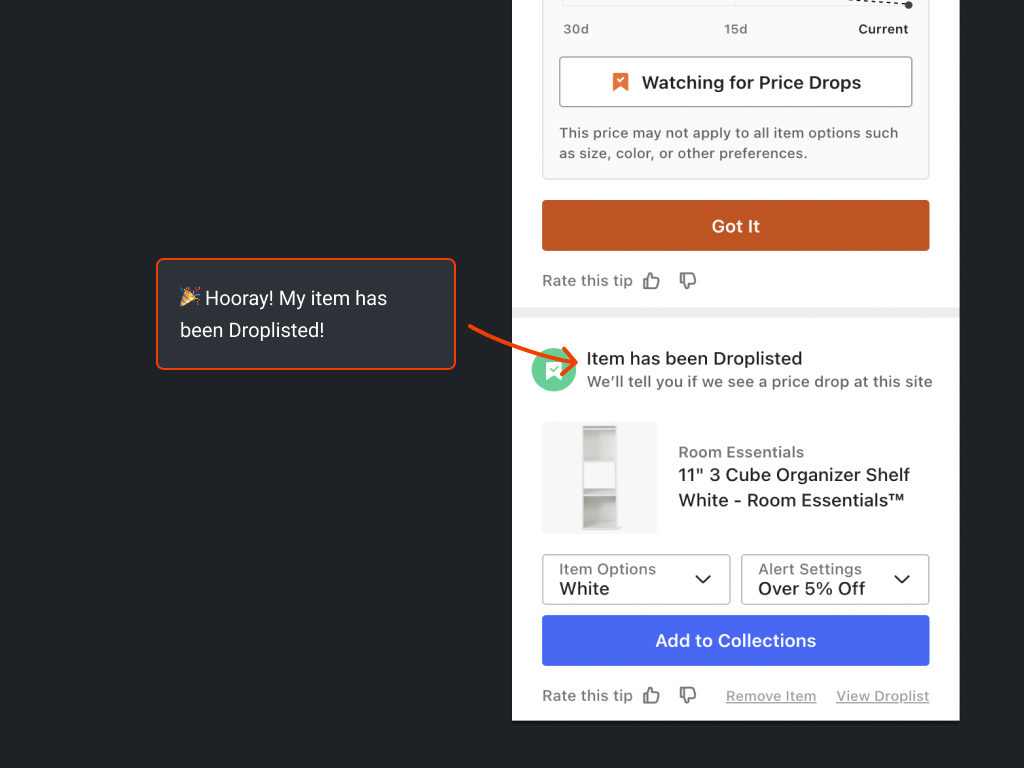
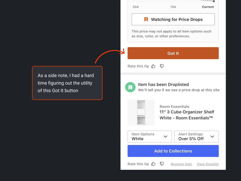
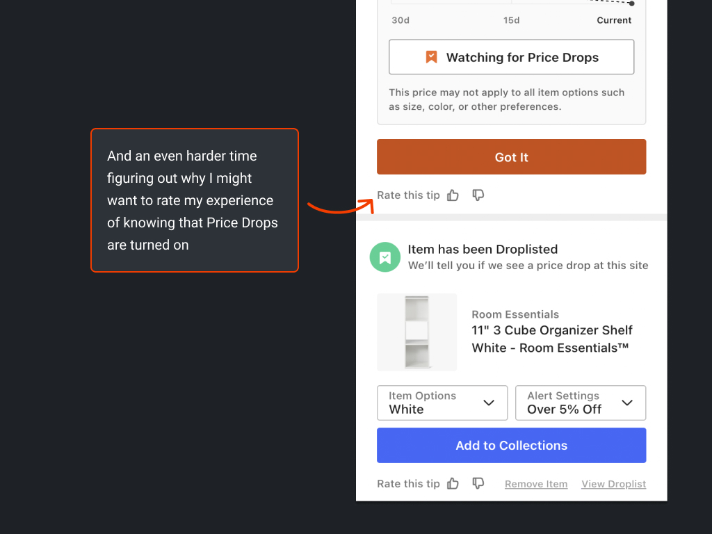
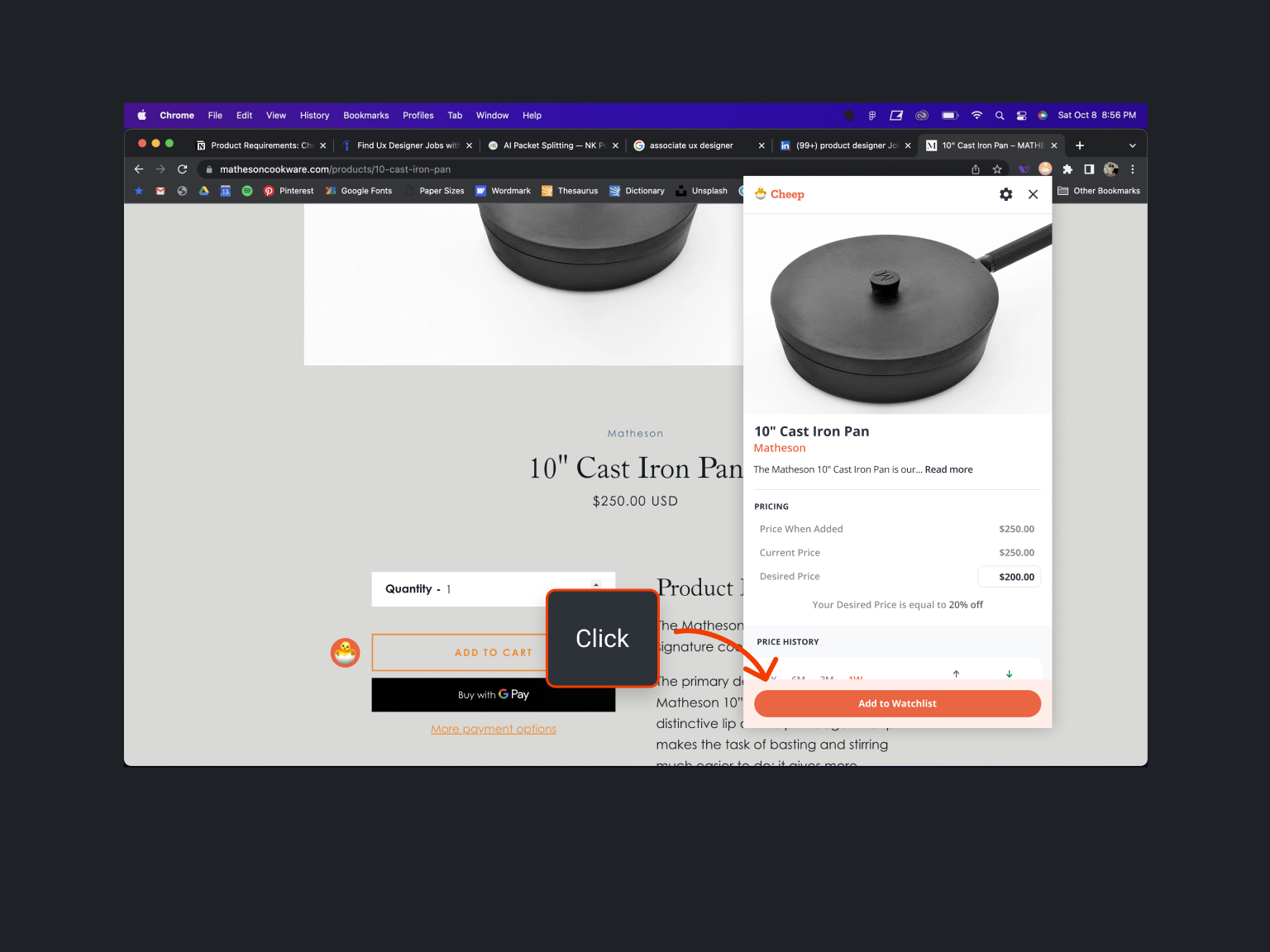
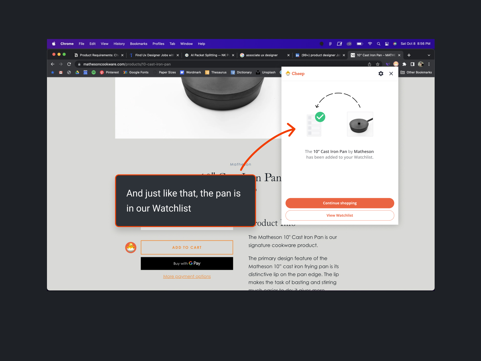
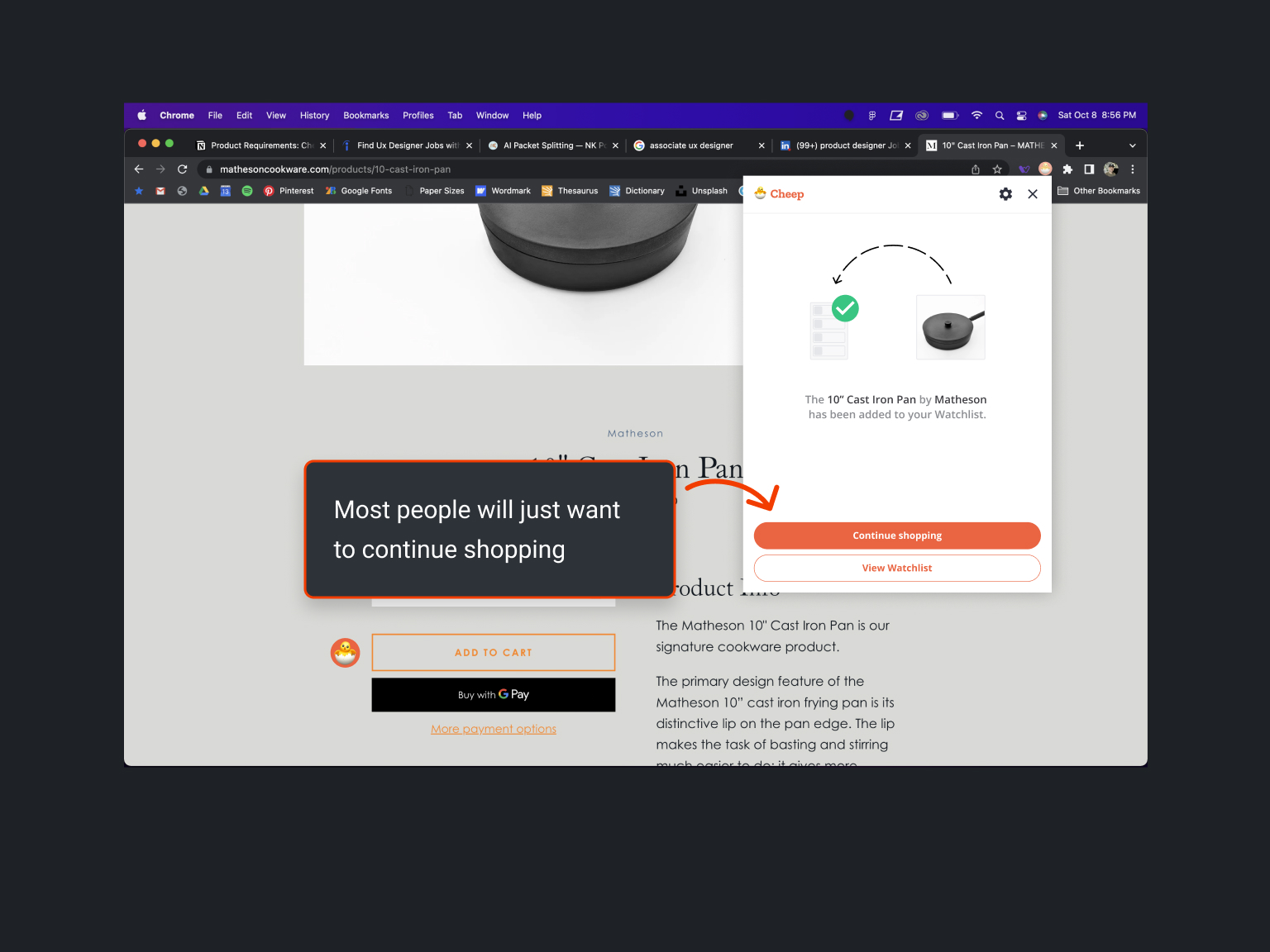
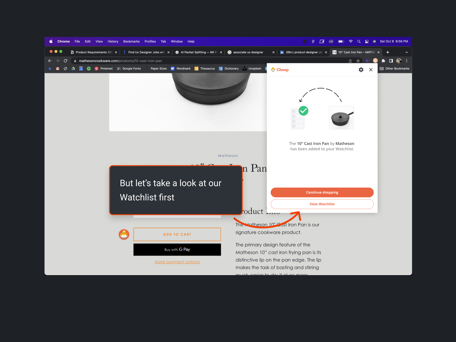
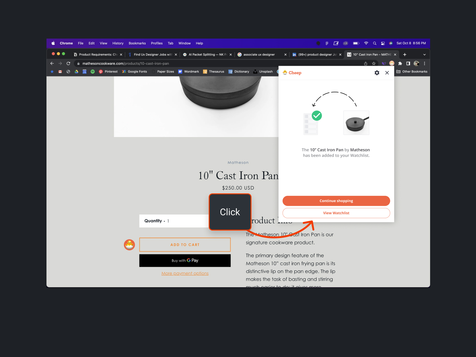
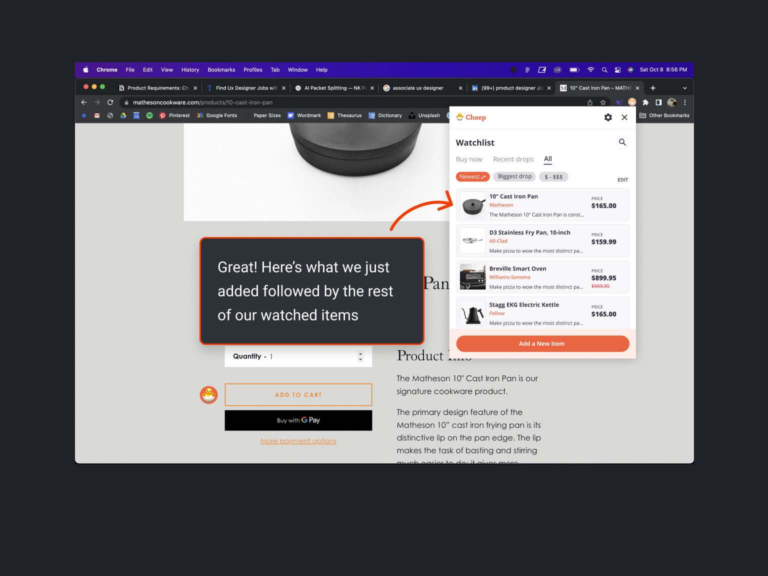
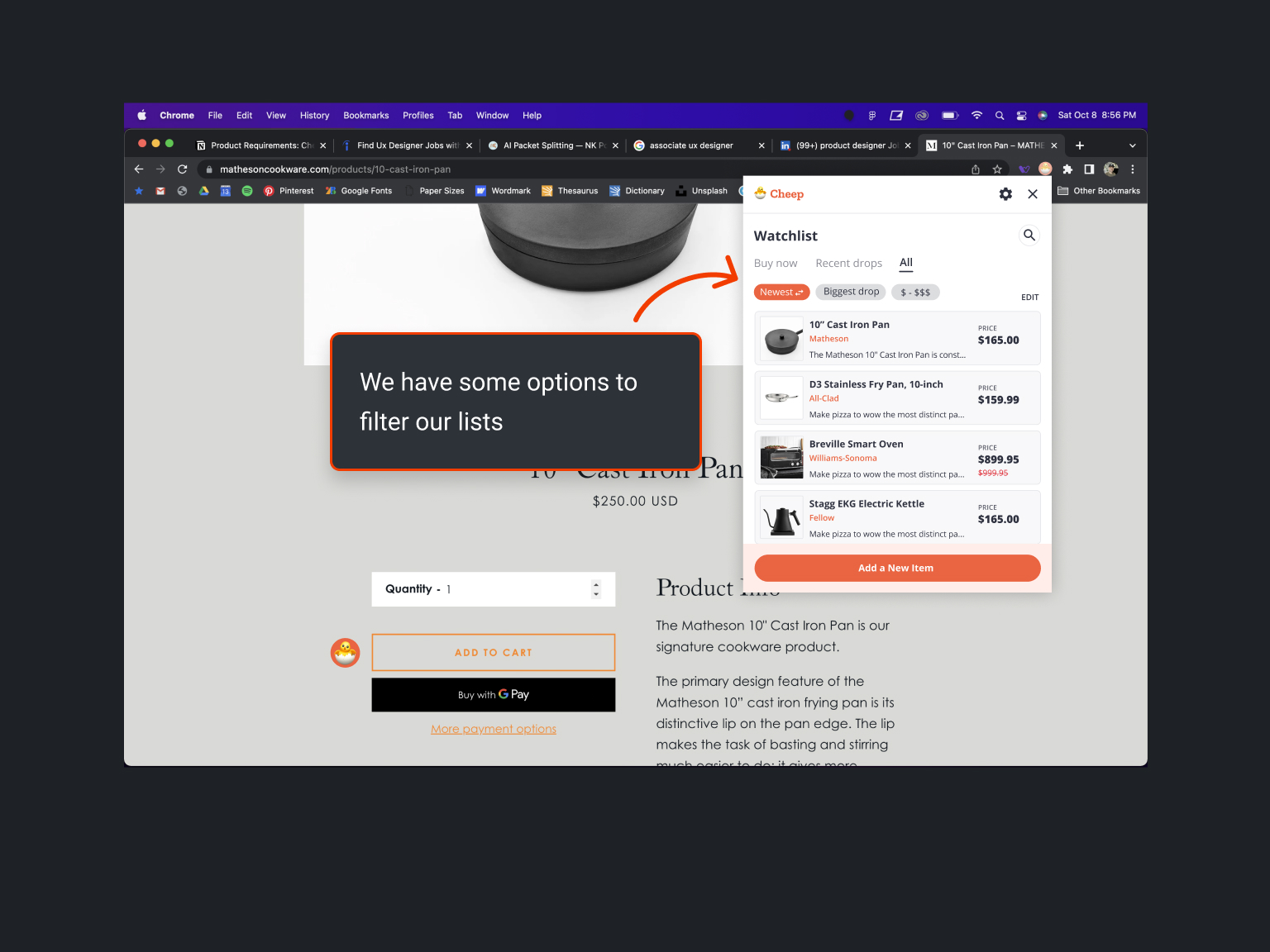
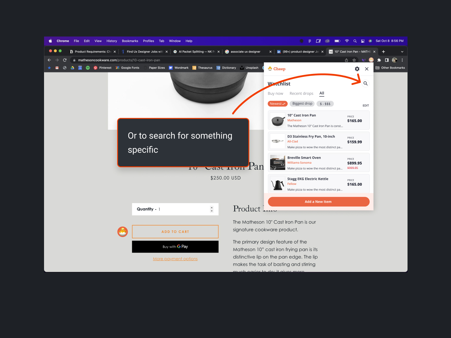
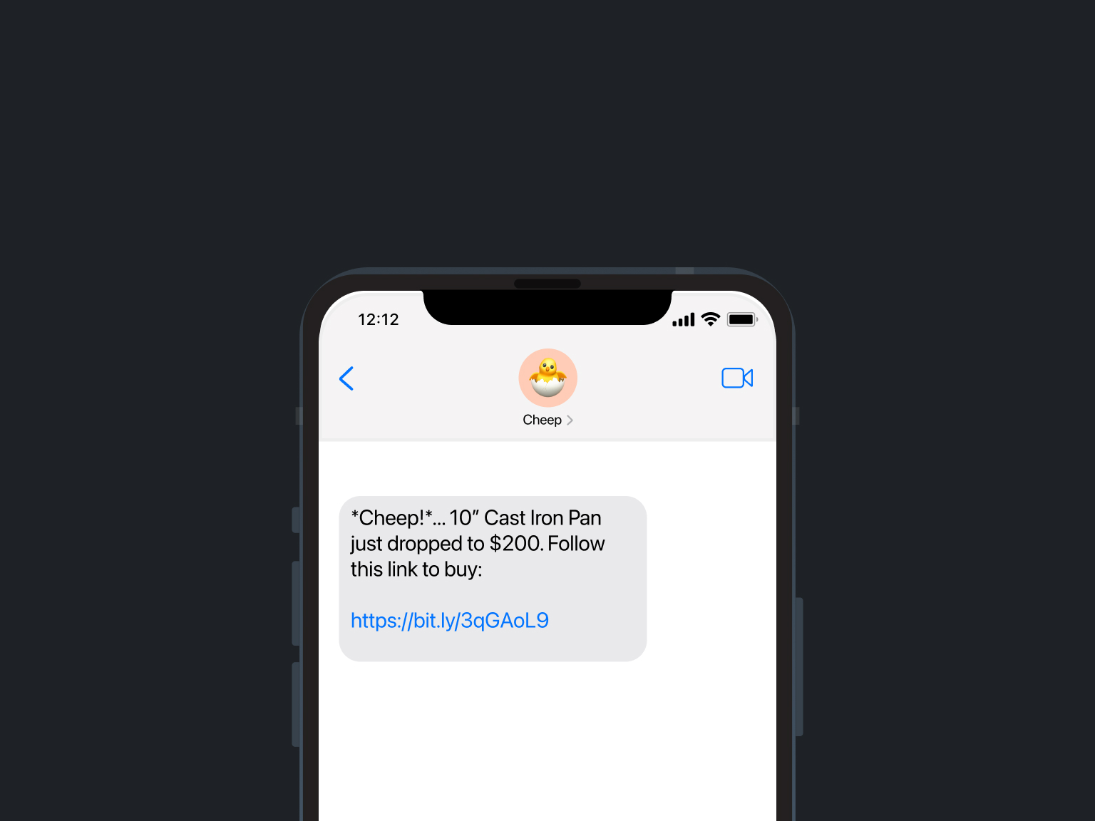
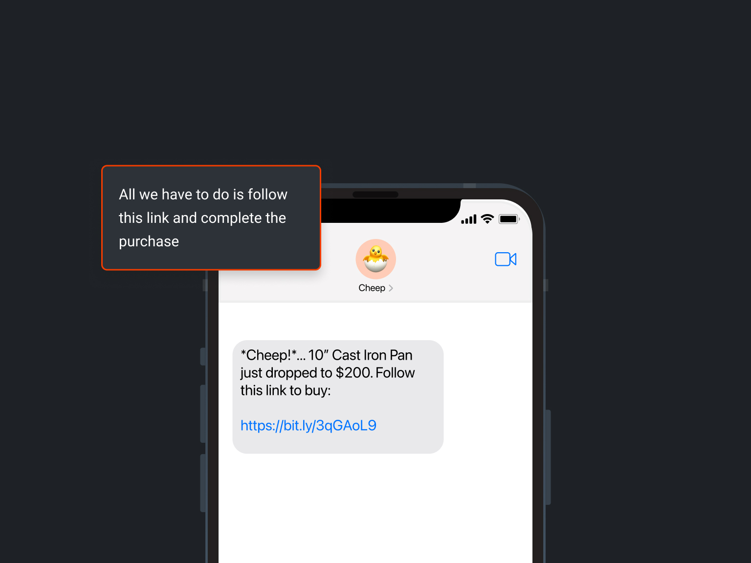
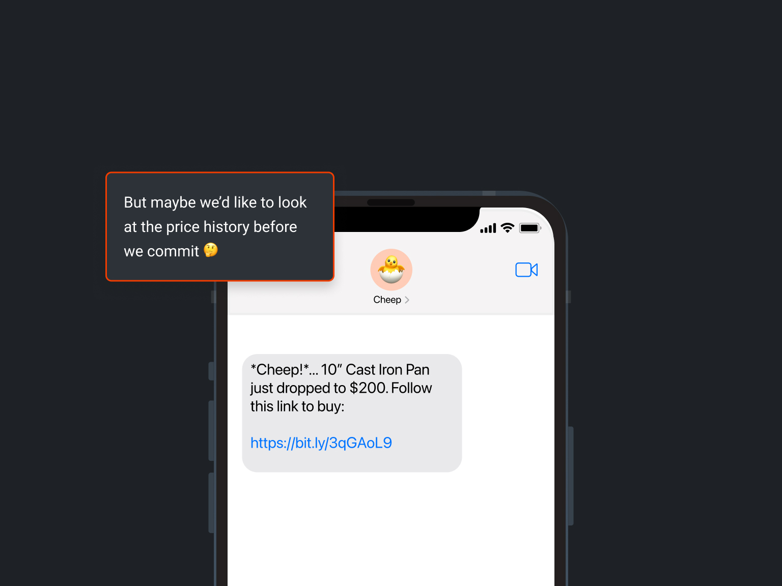
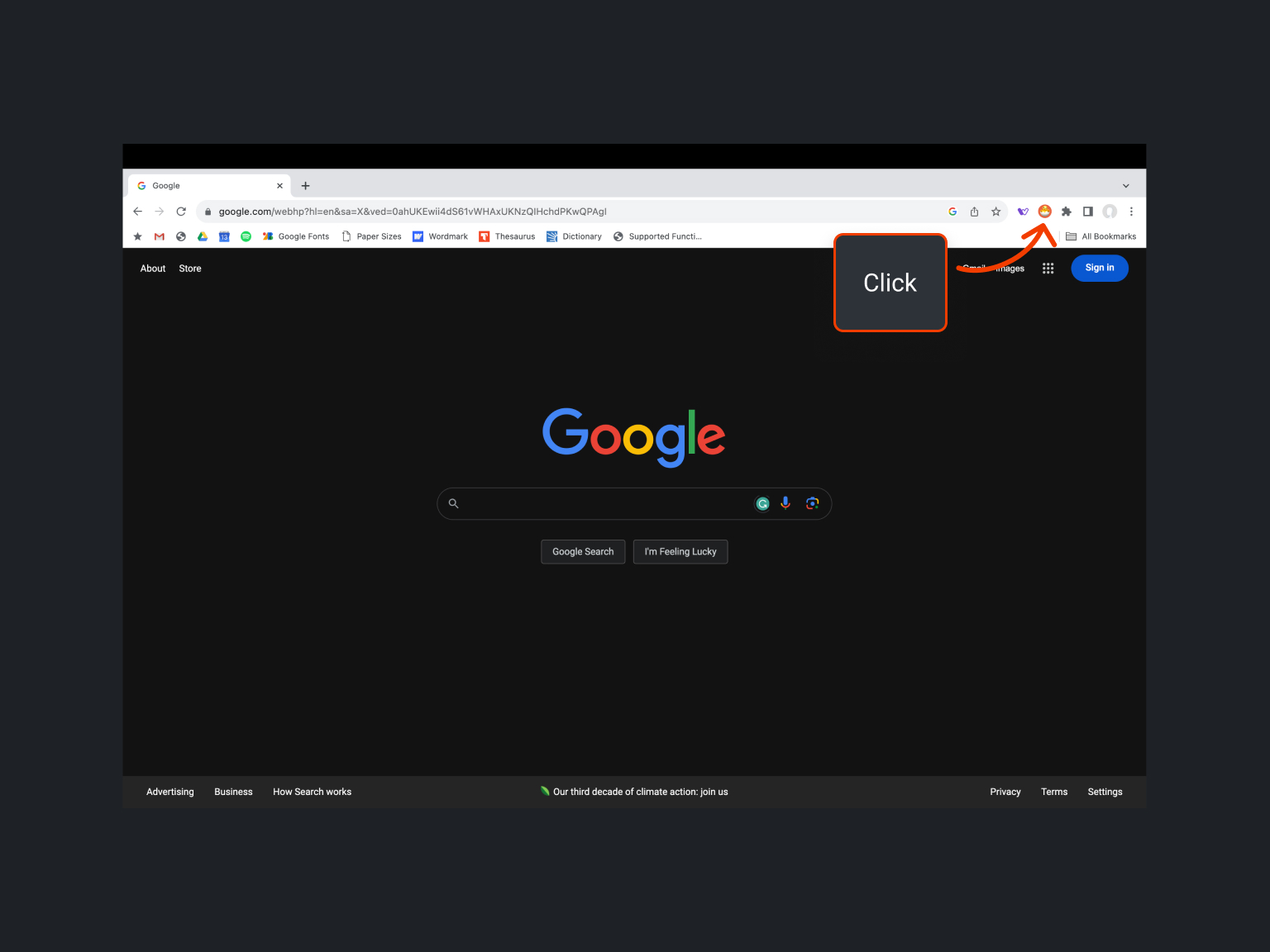
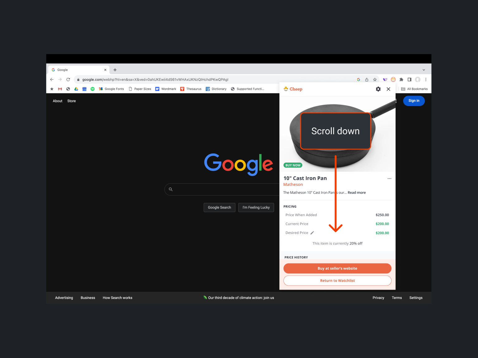
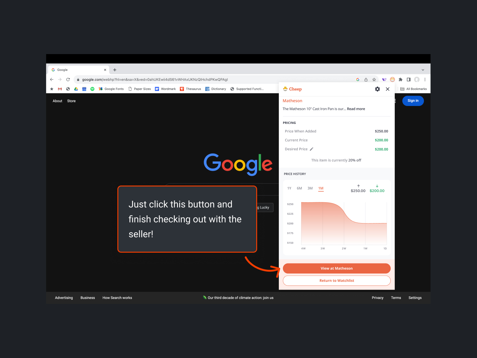
The happy path

Conclusion
- We started with a detailed PRD to establish the project's foundation.
- By exploring cart abandonment and consumer psychology, we leveraged strategies to improve discount perceptions and prioritized text notifications for better conversions.
- Unlike competitors like Honey and CNET Shopping, Cheep offers a unique value by tracking prices, monitoring price history, and providing timely notifications across multiple websites.
- An iterative, collaborative design process, guided by AJ’s feedback, significantly enhanced our user interface and experience.
- AJ's guidance helped develop a visually appealing and functional price history graph.
- Cheep’s simplified "happy path" makes adding items to the Watchlist and receiving price drop notifications easy and intuitive.
Impact
Combined user research, competitive analysis, and iterative design to create a sophisticated shopping assistant that addresses cart abandonment and user engagement, offering a seamless and effective shopping experience.
🤝
Thank you
I'll get back to you ASAP